3 Game-Changing iOS 8 Features No One is Telling You About

WWDC is underway and Apple has given us all loads of shiny objects to play with.
That’s a good thing and can also be a bad thing. I watched the Keynote with a smile on my face throughout and then it ended with a surprised face when Craig Federighi dropped the Swift bombshell!.

Don’t Implement Swift. Even Though it Looks Like Fun

All apps in a couple of years time will be programmed in Swift and I’m so excited to jump in and learn this cool new thing along with my team. As a developer, my first instinct was to re-write everything we’ve got in Swift 🙂 Wouldn’t that be cool?

swift

But I had to step back and think. The phrase “wouldn’t it be cool” serves me and not you as a customer. And that’s something you should also think about. You are the one having fun implementing a new language, but is your end user getting any benefit?

Make sure you don’t join the bandwagon, chase the shiny object and neglect your main goal. Delivering value.

I think the best way to go about it is to integrate Swift in stages into your app. Good thing, Objective-C and Swift can live together in harmony.. At least for a while.

Let’s jump onto the other things you need to know about iOS 8.

New Marketing and Monetization Opportunities

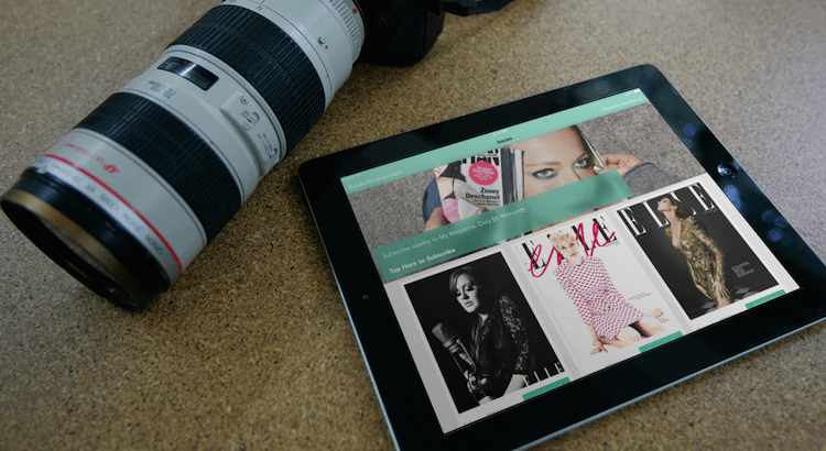
From the screenshots in WWDC, it seems the App store search results are now scrolling vertically and not horizontally anymore. Each entry shows the Title of the app and then a couple of screenshots.. That’s good. I hate swiping to the left to browse.. and this is going to change the way your apps are discovered.. again.

Your screenshots are more important than ever.

Also, we see the opportunities for bundled apps. This is going to be a game-changer. Now you have the opportunity to up-sell your users to spending more with you. When you go to McDonalds and you order a burger, you get the question… “Do you want fries with that?”, that’s an up-sell and it’s a fact that McDonalds makes most of it’s profits from the add-ons they sell to you. The fries and the cup of water (cough, sorry.. Coke)..

This will work best for you if your apps are related. For example, if you have a Scanner app and then a Photo Editing app, you can offer your users the whole suite of apps in one bundled price.

User Experience in Notification Center

It seems you can now drop a full UI into Notification center!. Well, I’m sure there will be restrictions but this is another game changer. I hate seeing some app notifications mostly because they are irrelevant and this is due to the fact that they are forced to show me the notification as text only.

screen

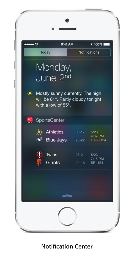
Imagine a podcast app telling me there is a new episode and I can play it right from the lock screen or your quiz app sends me a single questions challenge from a friend. I can;t wait to see what ideas come up. This is going to help with retention more than ever.

And More..

There is a lot to be excited about. I’m also looking forward to using CloudKit to add a backend to our Newsstand template to re-implement our Push notifications and Background downloading. Right now, we use Parse but it would be better to have everything under the Apple roof. Easier for you to work with.

HealthKit and HomeKit looks like it is going to allow a new category of apps. That’s something you should consider. The competition will be non-existent on Day 1 of iOS 8.

At the end of it all, make sure you deliver value to your end user and have fun while doing it. Here’s to a profitable implementation of iOS 8!

Depth, Deference, and Clarity:- Watchwords of the iOS 7 Human Interface Guidelines

How long has it been since you took a good long look at the iOS human interface guidelines? The release of the iPhone 5? iPhone 4? Earlier? Never? If you’ve not looked at them recently and given your iOS7 app development a top-to-bottom review, your work may be suffering. Don’t worry, though. In this article, we’ll be reviewing the key points of the guidelines, condensed and refined for the developer on the go.

Core Principals

RadDesign.in outlines three themes as the core of iOS 7 development:

Deference. An application’s interface doesn’t compete with the content—it stays out of the way or complements it.

Clarity. Text is easy to read at any size, icons are effective and precise, adornments are subtle, and function drives design.

Depth. Motion and layers work together to create a livelier, more engrossing user experience.

Developers should completely strip away their old UIs and reconsider their apps from the ground up, integrating the new design principals of iOS 7 to create a functional, consistent user experience.

Anatomy

Understanding the UIKit framework and its terminology can go a long way in helping a developer meet Apple’s human interface guidelines in their designs. It’s also important to realize the difference between developer perspective and user perspective in this area, i.e. the difference in perception of ‘views and view controllers’ vs. ‘screens’.

Quick In and Out

iOS 7 design themes place a premium on apps which function as users want them to function, given the ‘use for a minute or two of downtime’ nature of many iOS apps. A quick launch without splashes and start buttons and an equally speedy exit make for the most satisfactory experience.

That also means skipping prolonged setups where possible. Drive Dominion recommends settings which will satisfy 80% of your users, ignoring outliers, and gathering information from other sources when possible.

Functional Layouts

Layouts with more options aren’t always more functional. Tappable controls should be at least 44×44 points, as PossPW suggests. It’s also important to understand how users focus on content. The top left corner is most important, with user attention slacked the further down and to the right they move on their screen. Clever use of size, color, and proper alignment groupings will make it much easier for users to find what they need and access it in busy or distracting environments.

Navigation should be transparent. That is to say, you don’t want end users noticing your navigation; it should be so seamless and convenient that the user moves from content piece to content piece without ever having to consider how to get to their next goal. Similarly, you don’t want users to ever feel trapped in a dead end or modal task with no obvious route back.

Interaction

Certain gestures and methods of interaction are ingrained in iPhone users by now; if your app utilizes functions like the tap, drag, flick, swipe, double tap, pinch, touch and hold, or shake in a way that differs wildly from their standard usage, you can expect unhappy users. Likewise, don’t reinvent the wheel with custom gestures for standard activities. The only noteworthy exceptions to these baselines are games, where custom gestures often supply half the fun.

Style

Consistency between apps improves the user experience in animation, graphics, branding, and other aspects of style as much as in gestures. Gratuitous animations and other ill-considered attempts to ‘stand out’ fall flat in the iOS 7 environment. Refined, unobtrusive, and functional are the keywords for branding and other aspects of style.

Standards

An app communicates with users. Knowing the language of the iOS 7 environment is very important for accurate, precise communication; words and terminology have specific meanings to someone who has used other iOS apps with implications which do not exist outside of that environment. Similarly, there are a multitude of standard UI elements, particularly those from the UIKit, which people have become comfortable with.

Developers must carefully consider the needs of the end user and the goals of the human interface guidelines before introducing custom elements to the experience.

Behind the Scenes: How The Driver Vine App Was Created

See the Driver Vine App here

The Backstory

I thought speaking to the Government was scary but it actually turns out regular people work there 🙂 Okay, why am I saying this?

I decided to make an app for people taking the UK Driving Theory Test and it turns out, you can license the official question bank from the Driving Standards Agency at www.gov.uk

I got in touch by email and a nice guy called Alan replied and walked me through the process. You have to make sure the app doesn’t use official artwork, attribute the DSA etc.. and..

… you have to pay 13% royalty to the UK Government on any proceeds you make!

After Apple takes 30%, the Queen takes 13%, I probably will be left with enough to put petrol in the car…

.. but I still went on and made the app anyway and it is now live in the App Store.

Watch the video to see behind the scenes on how I got the app up and running.

1) You will see the DSA website where I got the license from
2) The actual stuff which was sent to me (See what I got instead of an API!, It’s like we are back in 1984)
3) How I managed to do the implementation in 2hrs (condensed to 4 mins)

Watch the video above and let me know what you think.

If you want to make your own Quiz/Test/Trivia app, take a look at the Quiz Maker template to give you a jump start

3 Profitable Apps And How They Got Successful

This is a Guest Post by Steve Chopper. Steve is a marketing grad who reviews business apps for a number of small biz blogs.

Success-driven entrepreneurs are led to believe that developing a mobile app will generate high profits and new streams of revenue. In actuality, apps lose 76 percent of users within the first three months, reports Entrepreneur. Gartner also predicts that only 0.01 percent of all mobile apps will be financially successful by 2018.

Mobile applications aren’t necessarily profit generators as much as branding and product awareness tools, explains Ken Dulaney, Gartner VP and distinguished analyst. Of course, there are a boatload of measurement and tracking tools for budding and established brands as well. For example, Chargify offers online recurring revenue management for businesses, as well as a free iPhone app that provides the user with a metrics overview. The app complements the company’s product and brands the mobile recurring revenue management experience.

Free apps and monetization challenges also block opportunities for profit gains, yet the the app market is certainly not in despair. In 2013, mobile app usage grew by 115 percent, and social apps for messaging grew by 203 percent, according to a report by Flurry Analytics.

Here’s a glance at three app success stories that have managed to surpass the test and launch into app victory:

CheckPoints: Lessons Learned

Free shopping and retail discounts app CheckPoints, created by inMarket, was launched in 2010. It also has a sequel app, List Bliss, following in its footsteps, as Entrepreneur points out. List Bliss simplifies grocery shopping by creating lists, tracking ingredients in pantries, offering sharing options, and reviewing coupons and products. For the second time around in app development, inMarket learned lessons, such as the value of attention to detail, which helped them earn more than 20 million users. Steer clear of a buggy, dead product with these inMarket tips:

  • Make registration simple and fast; impatient users will have no problem ditching your app’s sign up process
  • Make it minimally functional and purposeful; eliminate unnecessary items
  • Offer exclusive features to acquire devotion; focus on flexibility and an intuitive design
  • Pay attention to every detail and test every minor function
  • Continue to make tweaks, anticipate problems and implement customer service responses

Summly: Mobile App Millionaire

Nick D’Aloisio, a 17-year-old from London, created an app called Summly that turned him into an Internet millionaire after selling it to Yahoo. The app simplifies information and provides quick content summaries from thousands of sources.

The Guardian spotlights the ‘app-preneur’ and offers the following tips on how to make a fortune with your next big idea:

  • Ask yourself whether your app is appealing or if it solves a problem. Does it already exist, who will use it, and is it useful?
  • Find mentorship from an experienced app builder
  • Start a crowdfunding campaign to raise money for your app vision
  • Check out General Assembly, Steer or Code Academy to learn how to build the app independently
  • Promote the app with media attention, teaser videos and sign-up incentives

QuizUp: Surpassing Expectations

QuizUp went live in early November of 2013, and about a month after its launch, the app had more than three million users and 130,000 new downloads every day. QuizUp is a trivia app that connects users to friends or strangers. Users play against one another in a match of seven rounds and questions spanning a wide range of topics. In only seven days, QuizUp had one million users registered.

Forbes staff writer Prerna Shinha spoke with QuizUp founder and CEO Thor Fridriksson about how the app achieved outstanding immediate success. He shared that his app does the following:

  • Serves as an interactive platform; users can even create their own content for new and existing topics
  • Offers social features and micro communities; players can chat and participate in discussion boards
  • Provides educational opportunities, along with competitive and fun gaming
  • Appeals to passionate fanatics by creating topics that are niche and specific

Crash Course Part 2 : Creating a Newsstand App

Welcome to the second instalment of the crash course. In the last one, I gave you access to the free version of our Newsstand template.

Now, I want to show you how you can customize the template and add your own issues. We allow you to publish your magazines in either PDF or HTML. Hopefully, by now you already have an idea of what kind of magazine you want to publish and have some of the content in either format.

The next step is to watch the vide above and see how you can configure the app as your own and be able to download your issues in the iOS simulator.

Sample Magazine Issues

If you don’t have your content ready, I have got you covered. Included in your download are two sample magazines. The first one is in an HTML format and the second one is in the PDF format. If you don’t have it handy, you can download them here again.

These issues are from one of our magazine apps live in the App store, called Appville.


Live apps using the Newsstand HQ Template

You are also probably wondering if there are apps live in the App store using our template. The answer is yes. Here are links to a couple of them

Road Belly

Revista Santarem Digital


Video Course : How to Make an iPad Magazine App


Yay!. Thanks for signing up to get the sample Newsstand template and video course.

We have published the course as a YouTube playlist. 14 Videos in total!.. Take your time to watch them, no rush 🙂

Some other services out there will charge you an arm and a leg to get your magazine up and running. We here at App Design Vault HQ have decided to change the status quo.

You will find our option really affordable and easy to get up and running because we will be by you all the way.

Step 1: Go through the course

First off, watch this video to understand what this is all about and how to get started.

Then you can view the whole course here

Step 2: Download the Free Version

Here is the sample magazine templatethat goes along with the course. This app will let you see what is possible in the premium version of the Newsstand template. You can upload your issues, publish in both PDF and HTML, download and read your magazine issues in the iOS Simulator etc.

newsstand-3-1-1-1

Step 3: Run the App in Xcode

You will need to be registered as an Apple Developer to publish apps to the Newsstand App Store. If you haven’t done so already go here to register.

When you are done, download Xcode from the Mac App store and run the project file in your download. Look for the file called ADVNewsstand.xcodeproj.

You will then see a sample Magazine app where you can download issues, read them etc.

newsstand-2-1-1-1

What’s next?

In the next instalment, I will show you how you can get your own content in this sample magazine app. It won’t even take you more than 10 minutes to get all set up. Look out for the emails in your inbox.

If you have any questions, don’t hesitate to leave a comment below. I will be there to answer your questions.

Tutorial - How To Design An iOS 7 App

Introduction

iOS, the most popular operating system for mobile devices, has grown up and made it in version 7, while great new features and important improvements acclaim it as the most advanced mobile OS once again. From the totally redesigned user interface, until the last minor improvement, iOS 7 makes developers able to create applications more evolved and more sophisticated than ever. On the other hand, single, end users enjoy new, richer experience too, as, beyond the brand new UI, they are now more focused on their content and they access features quicker and easier.

This tutorial aims to approach the iOS 7 designing principles and give you a nice taste of it. A quick theoretical presentation is important so as some new design guidelines to be highlighted, but the most interesting part will come by upgrading visually a totally un-styled sample application. So, get on board and keep reading to explore some new great features!

The Sample Application and Our Mission

In order to follow the next steps of the tutorial and get the most out of it, we will use a pre-made, starter sample application, which you are advised to download now. In this section I’m going to present it and discuss a little about it, so if you want run and test it, but make sure to stick here and see what’s all about it.

This sample is just a demo of a mobile application regarding a store, which sells clothing, shoes and accessories products. It incorporates view controllers for displaying product data, product details, contact info and a map view with locations representing where products can be found. The next figure shows the initial screen of the app once it gets run:

As you see, the interface is totally un-styled and unpolished. No design at all has been applied, and all subviews have just been positioned to the appropriate places, maintaining their initial properties. If you would see an app with such an interface on the App Store, it’s certain that you would never have it downloaded. Before going deeper regarding all the interface negatives and how everything could become much better, it would be a good idea to do at this point a little more detailed reference on the app’s contents. So, first of all it’s obvious that this is a tabbed application, with three tabs in total. The controller of the first tab with the Collection title, is a navigation controller, which in turn contains a collection view (UICollectionView). In the collection view they have been populated all of the (demo) products along with some of their details. The previous figure shows the contents of the first tab.

Each product has detailed info, which is displayed on a secondary view controller that appears once a product gets tapped. The navigation controller is responsible for performing the back and forth transitions. Here is a sample of the product details view controller:

The app also contains a Contact tab. Behind this tab exists a map of the hypothetic store and some contact information. Here it is:

Finally, there is the Maps tab, which displays just a map with pins of stores that sell the demo products:

Our goal is to fix every bad-looking visual element, so as to transform the application to a great-looking, attractive and eye-catching one. The way we are going to move from here on is to visit every view controller separately, and for each subview that needs improvements we’ll firstly make a small discussion about what’s wrong and then we’ll add code that applies some design. Everything will be presented step by step, so every action we take will be clear. What you need to do, is to open the starter project and keep up with the steps described next.

Before we begin, you may go and run the starter project if you haven’t done so already. Navigate your self through all those four view controllers and get to know its functionality. Then get back here to discuss how the interface can be fixed.

The Collections View Controller

Step 1

Let’s begin working with the product collections view controller and let’s focus on the navigation bar for a while. Currently, it contains a bar button item at the left side of it and the title. One more item could be added at the right side, showing the total number of products one has shopped using the app using a badge icon. Actually, that would be great from programming view as well, as Apple doesn’t provide a built-in option for adding bar button items with badges on the navigation bar (even though this is done in the tab bar), so it would be interesting to see how this can be manually done. The navigation bar is shown right next before and after adding an extra bar button item with a badge on it:

Programmatically speaking now, go to the Xcode project and open the CollectionsViewController.m file. Head to the implementation of the setupNavigationBarItems method, and look at how the left bar button item is created in code. As you see, it’s pretty straighforward to way the button is created and how an image is used to represent it on the navigation bar. However, for the right bar button item we want to add, things are not that simple. The problem lies in the fact that we cannot use a simple image just like we did for the left button, because we want a badge to be displayed at the top-right, and its content must be able to be changed dynamically.

To better understand what’s possible to be done and what’s not, it’s necessary to say that the badge is going to be a UILabel object actually, which, and that’s the most important, needs to be added as a subview to the right bar button item. However, a plain UIBarButtonItem object doesn’t allow any subviews to be added to it, so we cannot use such an object in this case. To counter this, we’ll use a UIButton object, which firstly will be added as a custom view to the right bar button item (not as a subview), and secondarily, the badge label will be added as a subview to it.

The icon that will be used for the button is the next one and it’s named collections_right.

So, first of all, let’s create the UIButton button. Let’s see the code first and then we’ll discuss it.

-(void)setupNavigationBarItems{
    ...
    ...
    ...
 
    // Get the image.
    UIImage *collectionsRightImage = [UIImage imageNamed:@"collections_right"];
    // Create a custom UIButton with size equal to the image's size.
    UIButton *rightButton = [UIButton buttonWithType:UIButtonTypeCustom];
    [rightButton setFrame:CGRectMake(0.0, 0.0, collectionsRightImage.size.width, collectionsRightImage.size.height)];
    // Set the image to its image property.
    [rightButton setImage:collectionsRightImage forState:UIControlStateNormal];
 
}

Initially, we get the image as a UIImage object. After that, we create a custom UIButton, named rightButton. It’s quite important to make its size equal to the image’s size, and that’s what is being done next. Finally, we set the image that appears in the normal state of the button. Note that we set no title for it, just the image. Even though the button is now ready, if you run the app you won’t see it appearing on the navigation bar. That’s because we haven’t added it yet to the navigation bar. This is going to be done in a while.

According to the image of the outcome, the badge label must be rounded, and that can be achieved by utilizing the setCornerRadius method of the layer label’s property. In order to access the layer, it requires the QuartzCore framework, which is already imported to the project. Let’s write the code that creates the badge label first, and then we’ll say a few things about it, even though there are comments describing each line.

-(void)setupNavigationBarItems{
    ...
    ...
    ...
 
    // Create a custom UILabel object with the following frame, so as to make it appear at the upper-right side of
    // the custom UIButton.
    UILabel *badge = [[UILabel alloc] initWithFrame:CGRectMake(rightButton.frame.size.width - 6.0, rightButton.frame.origin.y - 4.0, 15.0, 15.0)];
    // Set the background color.
    [badge setBackgroundColor:[UIColor colorWithRed:1.0 green:91.0/255.0 blue:84.0/255.0 alpha:1.0]];
    // Set the corner radius value to make the label appear rounded.
    [[badge layer] setCornerRadius:8.0];
    // Set its value, alignment, color and font.
    [badge setText:@"5"];
    [badge setTextAlignment:NSTextAlignmentCenter];
    [badge setTextColor:[UIColor whiteColor]];
    [badge setFont:[UIFont fontWithName:@"Helvetica-Bold" size:12.0]];
    // Add the image as a subview to the custom button.
    [rightButton addSubview:badge];
}

Let’s see the code line by line. At first, we allocate a UILabel object named badge, using the initWithFrame: method in order to set the frame we want. It’s obvious that the calculations been made regarding the X and Y origin points of the label define its position. After that, we set its background color. These color values compose the color shown in the sample image. The next line is the one that the QuartzCore framework has been linked for. Through the layer property of the label, we set the corner radius to 8.0 points to achieve the round shape. You can change it if you want, but I guess it’s the best value that gives us an almost perfect circle. All lines that follow are quite simple, as they set the label’s text, alignment, color and font values. Finally, the label is added as a subview to the button. Not really hard after all, right?

One thing has been left to be done, and that is to add our custom button to the navigation bar. That’s simple:

-(void)setupNavigationBarItems{
    ...
    ...
    ...
 
    UIBarButtonItem *rightBarButtonItem = [[UIBarButtonItem alloc] initWithCustomView:rightButton];
    self.navigationItem.rightBarButtonItem = rightBarButtonItem;
}

Notice that in this case we use the initWithCustomView: to initialize the bar button item and to provide our custom button. If you run the app now you will see that the navigation bar is ready, even though the bar button items trigger no action. So, a part of the app has been prepared and we are ready to move forward to the next one.

Step 2

Let’s focus now on the collection view and the way the data existing on its cells is displayed. It is apparent that visual improvements are urgently needed, but let’s do everything in order.

First of all, we can avoid the white tediousness simply by altering a bit the background color of the collection view, and making it more grayish. That’s quite easy to accomplish. In the CollectionsViewController.m file go in the viewDidLoad method, and locate this line:

_cvCollections.backgroundColor = [UIColor whiteColor];

Then, change it to this one:

_cvCollections.backgroundColor = [UIColor colorWithWhite:0.95f alpha:1.0f];

If you give the app a try, then you’ll see the difference.

Let’s deal with the collection view cells now. Each product brand title needs to be fixed, in order to properly fit on the cell and clearly display its content. Further than that, the views, likes and purchases stat values are pretty big and not in accordance to the respective icons. Therefore, we need to decrease the font size for both the brand title and the stat values, and to make it even better we could change the stats’ text color, so it perfectly matches to the icons. All these modifications will take place on the CollectionsCell.m file, as the collection view cells have been subclassed in order to be easily customized. Once you open this file, navigate yourself in the awakeFromNib method, and add the next code fragment in it:

-(void)awakeFromNib{
    ...
    ...
 
    [_lblBrand setFont:[UIFont boldSystemFontOfSize:13]];
 
    UIFont* smallFont = [UIFont systemFontOfSize:12];
    [_lblLikes setFont:smallFont];
    [_lblPurchases setFont:smallFont];
    [_lblViews setFont:smallFont];
 
    [_lblLikes setTextColor:[UIColor colorWithRed:1.0 green:91.0/255.0 blue:84.0/255.0 alpha:1.0]];
    [_lblViews setTextColor:[UIColor colorWithRed:1.0 green:91.0/255.0 blue:84.0/255.0 alpha:1.0]];
    [_lblPurchases setTextColor:[UIColor colorWithRed:1.0 green:91.0/255.0 blue:84.0/255.0 alpha:1.0]];
 
    self.contentView.backgroundColor = [UIColor whiteColor];
}

Firstly, the brand label title gets changed to a smaller font size. Doing so we manage to avoid the clipping that occurs when the brand name is too large. Next, we specify a smaller font size for all stat values as well, and we assign it to them. Finally, we set the appropriate text color to all stat labels, so as they fit to their respective icons. Besides that, the cell’s content view background color is set to white, so it gets emphasized even more over the gray collection view background.

Here is a sample after our changes:

The Collection Detail View Controller

If you have tested the sample application, then you know that when tapping on a product in the collections view controller, a new one containing just the selected product shows on-screen. Even though the displayed information is clear enough, looking at it from the design aspect becomes obvious the imperative need to visually upgrade it.

There are various changes that can be done here. One cool modification would be to place the brand title above the image, and in order to make it an eye-catching label we could add a semi-transparent background view behind it. Also the title’s text size can be increased and its color turn to white. Regarding the stat titles and values, we could re-arrange them in way similar to an Instagram profile page and even more, to slightly change their color to a more grayish one.

Here is a sample of the outcome after applying our changes:

Step 1

Let’s begin by adding the brand title’s background view, as shown at the image above. lick on the Main.storyboard file to let it appear on Interface Builder. Next, go and locate the Collection Detail Controller scene:

From the Object Library in the Utilities Pane, drag and drop a UIView object in front of the existing image view on the scene. Perform the next two actions on the view object:

  1. Set its frame. On the Size Inspector of the Utilities Pane, set the next values: X=0, Y=272, Width=320, Height=54.
  2. Connect the overlayView IBOutlet property with it.

Once you do so, send the new UIView object to back, using the menu Editor > Arrange > Send to back. After that, send the image view to the back using the same method. This will make sure that the view will be above the image view but underneath the brand title label.

This view object is now ready, so we can move on to the re-positioning of the brand title and all stat labels. Below are listed the new frames for all labels, which are noted using their respective IBOutlet property name.

  • titleLabel: X=20, Y=279, Width=280, Height=36
  • likesCountLabel: X=20, Y=340, Width=91, Height=43
  • viewsCountLabel: X=115, Y=340, Width=91, Height=43
  • purchasesCountLabel: X=214, Y=340, Width=91, Height=43
  • likesLabel: X=20, Y=383, Width=91, Height=21
  • viewsLabel: X=115, Y=383, Width=91, Height=21
  • purchasesLabel: X=214, Y=383, Width=91, Height=21

After having applied the above values to all labels, there is one just thing that needs to be done. Select all labels except for the brand title label, and center the text alignment though the Attributes Inspector, so they are all vertically aligned. Your scene now should look like this:

Step 2

Let’s do some coding now, starting from the brand title label. Our work will take place in the CollectionDetailController.m file, inside the viewDidLoad method.

For starters, add the next two lines which change the brand title label’s text size and color.

- (void)viewDidLoad
{
    ...
    ...
 
    _titleLabel.font = [UIFont boldSystemFontOfSize:22.0f];
    _titleLabel.textColor = [UIColor whiteColor];
}

Next, instantiate a font and a color object to be used on all stat value labels. After doing that, set the font and color values to those labels:

- (void)viewDidLoad
{
    ...
    ...
 
    UIFont* countFont = [UIFont boldSystemFontOfSize:25.0f];
    UIColor* countColor = [UIColor colorWithWhite:0.6f alpha:1.0f];
 
    _likesCountLabel.font = countFont;
    _likesCountLabel.textColor = countColor;
 
    _viewsCountLabel.font = countFont;
    _viewsCountLabel.textColor = countColor;
 
    _purchasesCountLabel.font = countFont;
    _purchasesCountLabel.textColor = countColor;
}

So far, so good! We need now to do the exact same thing for the stat title labels:

- (void)viewDidLoad
{
    ...
    ...
 
    UIFont* labelFont = [UIFont boldSystemFontOfSize:14.0f];
    UIColor* labelColor = [UIColor colorWithWhite:0.6f alpha:1.0f];
 
    _likesLabel.font = labelFont;
    _likesLabel.textColor = labelColor;
 
    _viewsLabel.font = labelFont;
    _viewsLabel.textColor = labelColor;
 
    _purchasesLabel.font = labelFont;
    _purchasesLabel.textColor = labelColor;
}

One more thing before our job is finished. We have to make the brand title’s background view transparent (the overlayView object), by modifying its background alpha value:

- (void)viewDidLoad
{
    ...
    ...
 
    _overlayView.backgroundColor = [UIColor colorWithWhite:0.0f alpha:0.4f];
}

We are ready. Run the application to see what a great visual impact have been caused by all changes we’ve done.

Step 3

While being in the collection detail view controller, you may notice one more visual element that can be touched and match the general design we are trying to apply on the application. This is the Back button on the navigation bar. Currently, its color is set to the default blue one specified by the operating system. However, if we would change it to red, then it surely would seem much cooler. So, let’s do it!

A navigation bar’s item color can easily be changed, using a single line of code. Open the AppDelegate.m file, and go to the application:didFinishLaunchingWithOptions: method. Add the next one:

- (BOOL)application:(UIApplication *)application didFinishLaunchingWithOptions:(NSDictionary *)launchOptions
{
    [[UINavigationBar appearance] setTintColor:[UIColor colorWithRed:1.0 green:91.0/255.0 blue:84.0/255.0 alpha:1.0]];
}

Through the tint color property we can change the color of the bar button items. Note that this property in iOS versions prior to 7 would change the background color of the bar, and not the buttons’ text color. Also, the [UINavigationBar appearance] works globally for all navigation bars that may be added to an application as parts of navigation controllers.

Here is the back button now:

The Map View Controller

Our mission to set a new great design to the sample application keeps going perfect, and simply by running it and watching the results it becomes obvious that great improvements have been made up to here. But we don’t stop here, as there are a couple of view controllers that need to be fixed as well. So, let’s continue and this time let’s visit the Map View Controller, the content behind the third tab of the tab bar.

Sincerely speaking, there is nothing particular in this view controller that needs to be changed, as a full-screen map covers the entire view. However, while being in this view controller the tab bar’s deficiency is highlighted. Let’s discuss it for a while. The problem with it is that its neutral, white appearance makes no impression at all. More over, the tab titles are quite close to the icons, and in the last tab especially, the title overlaps the icon, and this is a mistake that not even amateur designers should make. What can make these tabs really unique, is just a couple of simple things. First of all, we can make the tab bar catching the eye by setting another tint color on it and leaving the white color back to history. The title-icons problems can be overcome, if we simply omit the titles and allow only icons to exist on the tabs. By doing so, our tabs will acquire more space, and they’ll look far better than now. As a last touch, we can make the selected tab to greatly distinguish from the others, simply by using a different background. All those modifications, even small, will greatly improve the app’s appearance. The next two figures demonstrate the tab bar looking, before and after the changes we will apply later.

Start off by removing the tab titles. To do that, open the Main.storyboard file. Here is what we should do next for each one navigation controller:

  • Click on the tab item.
  • On the Attributes Inspector inside the Utilities Pane, locate the Title field under the Bar Item section, and delete its contents, as shown to the next image.

The first step is ready. Let’s go now to change the tint color of the tab bar, to set a selection background image and do some more setup in code. Open the AppDelegate.m file and go to the application:didFinishLaunchingWithOptions: method. Add the next line to set a new tint color:

- (BOOL)application:(UIApplication *)application didFinishLaunchingWithOptions:(NSDictionary *)launchOptions
{
    ...
    ...
 
    [[UITabBar appearance] setBarTintColor:[UIColor colorWithRed:1.0 green:91.0/255.0 blue:84.0/255.0 alpha:1.0]];
 
    return YES;
}

Next, we will set the tab bar icons in code, even though they have been already added through the Interface Builder, because we need to specifically set their position and the way they will appear. Inside the same delegate method, add the next code fragment and we’ll talk about it later:

- (BOOL)application:(UIApplication *)application didFinishLaunchingWithOptions:(NSDictionary *)launchOptions
{
    ...
    ...
 
    UITabBarController *tabBarController = (UITabBarController *)self.window.rootViewController;
 
    NSInteger index = 1;
 
    for (UIViewController* controller in tabBarController.viewControllers) {
 
        // Set the image of the tab bar items.
        NSString* tabImageName = [NSString stringWithFormat:@"tab%d", index++];
         [controller.tabBarItem setImage:[[UIImage imageNamed:tabImageName] imageWithRenderingMode:UIImageRenderingModeAlwaysOriginal]];
 
        // Apply the following insets so all tab images look vertically centered.
        UIEdgeInsets insets = UIEdgeInsetsMake(5.0, 0.0, -5.0, 0.0);
        [controller.tabBarItem setImageInsets:insets];
    }
 
    return YES;
}

Notice that we use the imageWithRenderingMode: method of the UIImage class, after we get the image itself using the imageNamed method. The imageWithRenderingMode: is new in iOS 7, and its aim is to create a new UIImage object based on the provided rendering option. We provide the UIImageRenderingModeAlwaysOriginal as a parameter, because we simply want to tell iOS that we desire to render the specific image as it originally is.

By modifying the insets of each icon, we simply push all icons from the top towards the bottom (metaphorically speaking) and set the icons to the appropriate position. If you’d like, just comment out the last command of the loop and test the app. You’ll find out that the icons are not well-positioned in this case.

All the above do perfectly our job, but the different background image for the selected tab is yet missing. Let’s add this too, and the tab bar is ready. So, add the next line to the method:

- (BOOL)application:(UIApplication *)application didFinishLaunchingWithOptions:(NSDictionary *)launchOptions
{
    ...
    ...
 
    [[tabBarController tabBar] setSelectionIndicatorImage:[[UIImage imageNamed:@"tab_sel"] imageWithRenderingMode:UIImageRenderingModeAlwaysOriginal]];    
 
    return YES;
}

The selectionIndicatorImage property defines the background image that will be used for the selected tab, and that’s why is being used here. The tab bar has now been fixed, so feel free to go and test the app. Here is an image with the outcome of our effort:

The Contact View Controller

The last task that’s left to be done, is to do any required design changes on the Contact View Controller. In this one, a map view along with contact info are presented to the user, but the way everything is currently displayed is both unattractive and not that easy to read.

Consider now of the following couple modifications, that when they’ll be done this view will seem much cooler and professional. First of all, the map is currently occupying just a portion of the view controller, but if its width would change so it lays out from edge to edge, it surely would look a lot better. Further than that, the contact info the way it’s presented now, it’s hard to be read and even more, a clipping occurs to the e-mail address as it’s too big to fit on the view. It would be easier for users to focus on this info, if the font size could become a little smaller, and the text color would change to a gray one. So, let’s go and do all these.

Starting from the map view, let’s change its size using the Interface Builder. Open the Main.storyboard file and go to the Contact View Controller scene. Select the map view and set the following frame values through the Size Inspector: X=0, Y=0, Width=320, Height=229.

Let’s add some new style to the information text now. Click to open the ContactViewController.m file, and go to the viewDidLoad method. In here, we’ll add code for changing the font size and color of all labels. Add the next fragment and you’re done:

- (void)viewDidLoad
{
    ...
    ...
 
    _contactLabel.font = [UIFont boldSystemFontOfSize:18.0f];
    _contactLabel.textColor = [UIColor colorWithWhite:0.6f alpha:1.0f];
 
    _addressLabel.font = [UIFont systemFontOfSize:16.0f];
    _addressLabel.textColor = [UIColor colorWithWhite:0.6f alpha:1.0f];
 
    _telephoneLabel.font = [UIFont systemFontOfSize:16.0f];
    _telephoneLabel.textColor = [UIColor colorWithWhite:0.6f alpha:1.0f];
 
    _emailLabel.font = [UIFont systemFontOfSize:16.0f];
    _emailLabel.textColor = [UIColor colorWithWhite:0.6f alpha:1.0f];
}

Here is the outcome:

Designing an App in iOS 7

The features that iOS 7 incorporates are numerous. However, the most apparent one, immediately noticeable once you look at iOS 7, is the all-brand new user interface (UI). Redesigned from the ground-up, a clean, flat and uncluttered look and feel now dominates and nothing has been left to remind us of previous iOS versions. Translucency is characteristic for many UI controls (such as bars), while all buttons have become borderless. One could say that Apple’s primary target regarding the UI was to make it as minimal and simple as possible, trying the same time to provide users with plenty of open and white space. Indeed, the whole design generally, and the flatten look in particular, lead users to focus to content without too many distractions from the interface elements. That fact becomes more apparent, if we consider that skeuomorphism belongs to the past as well (see for example the redesigned Game Center app).

iOS 7 brings new air, and all of its controls have been totally redesigned too. Not even one control has been left the same, or almost the same, with previous versions of iOS. And if you haven’t seen them yet, now it’s a good time to do it. Get the latest Xcode (version 5), which has also been refreshed so as to fit to the new ecosystem, and take a look to all new iOS 7 visual elements.

However, even though visual changes are too many, it isn’t hard to work with the new operating system. Controls keep working as they did, gestures are the same as previously and generally, it’s pretty easy for everyone to work with the new system as everything behaves as it used to behave. Imagine how hard it would be for developers, if behavior of controls would change too. Apart from a face lift, a radical core modification would be required for every application. Therefore, programmers appreciate that beyond the look and feel, the way the iOS interacts with the user is still the same.

iOS 7 gives developers a great opportunity to update their applications and adopt all those new features that introduces, but most importantly to adopt the new user interface. For those who have developed applications using the built-in controls, that would be a relatively easy job. However, more effort is required from all those who have built custom controls and graphical elements. There is also another important difference in iOS 7, which is not directly visible. In this version of iOS, Apple considers that users are now familiar enough with the iOS, and that’s also a reason that some controls may not point out their purpose as clear as they did in previous versions of the operating system. For example, in previous iOS versions a button was clearly indicating its purpose, with border, shadow, etc. while in iOS 7, a button is just a borderless area with a string value or an icon inside it.

Everyone who begins developing applications for iOS 7 should walk through the Apple’s Human Interface Guidelines (HIG) before writing even a line of code. I will highlight in here what one should always have in mind when designing new or updating existing apps.

First of all, great attention should be given to the content and not in the interface itself. Actually, the UI should only support the content, not compete with it and of course, it should never distract users from content. Everything in iOS 7 work for content’s benefit, even view controllers, which now occupy the entire screen instead of the available space that was left between navigation and tab bars. Also, translucency should be used from views and controls to denote any extra content existing underneath them, and even more, to provide hints on how this content can be accessed. All this is what Apple calls deference.

Besides all that, not only content should be easily noticeable and understandable, but commands and controls that cause interaction should be distinguishable too. An approach to that is to use different color schemes for controls and the content, as well as to pick fonts that highlight the content. This logic is what Apple says clarity.

When there are too many views on-screen that users have to deal with, then it’s necessary to be organized in a way that makes it easy to access the appropriate content according to their needs. A nice method to do that is to use visual hierarchy and appropriate positioning on all views that appear on screen, and that way give the feeling of the depth. This also can be achieved if views get separated in layers so everything is easy to be distinguished by the user.

Auto-layout, which was first introduced in iOS 5 and it was an optional feature for programmers, has now become almost a mandatory rule. Apple not just recommends, but actually dictates to use the auto-layout feature, so the iOS can arrange all views and subviews the way it wants. I don’t think that there are many developers out there who still don’t use this feature. In case you are one of them, then it’s surely time to start using it. The great with auto-layout is that programmers don’t have to worry about the view positioning when the device changes orientation, or how to lay views in multiple screen sizes. iOS is the boss and decides about everything.

Taking the auto-layout a step further, it’s well known that, until iOS 6, when developers had the auto-layout enabled, they also had to mess with constraints that should have been properly set, so everything was correctly arranged on-screen. Even more, if views were manually created in code, then it was a little bit hard to set constraints manually. Generally, constraints many times were proved to be a really nuisance. Now, with iOS 7 (and the new Xcode version), this limitation has gone. By default, no constraints are set in views in Interface Builder, but developers can set them optionally. There is now much more freedom on both the kind of the constraints, and the way they can be applied, a fact that gives more power to programmers.

Generally speaking now, when talking about iOS designing, views, controls, etc, the discussion cannot stop here. However, through this theoretical approach, they have been presented all those necessary, basic guidelines that one should have in mind when building apps for the new version of the operating system. So, keep all these and let’s go to make this tutorial even more interesting, by seeing some action in a sample application.

Summary

You can download the initial and final projects here. Through this tutorial an effort was made to demonstrate how a totally un-styled app, with no design applied at all, can be transformed to a really cool, professional-looking and attractive one, simply by using a short and easy code. Indeed, neither extremely hard work took place, nor too many code lines were written. Having in mind the new interface guidelines, one can style an application quite fast and with little effort.

The Newsstand Template is now updated for iOS 7

We have been hard at work trying to get the Newsstand template updated for iOS 7. Finally, it is ready.

If you have access to the template, you can now login to your account and download the new version.

NOTE: the documentation has changed slightly so make sure to read it through to understand how to use the new version. Towards the end of this post, I will let you know the main points to look out for.

Here are the release notes and the changes you can expect to see.

- Added In-app receipt validation
- Now Connecting to Apple servers to validate purchase receipts
- Fixed issue with restoring purchases made from another device
- Added iOS 7 compatible resources for current design themes (red, blue and Magrack)
- Added a new Flat design theme, Looks great on iOS 7.

Here are some other changes we added.

New: Video Tutorial

Some of us don’t like reading, eh? I feel your pain. So I decided to make a video tutorial as part of the documentation to show you how to setup the template.

Here is the playlist on YouTube. Currently clocking at 14 videos!

videos-1-1

New Magazine Kiosk Design

Below you will see that we added a new design that will look right at home on the iOS 7 device. It sports a new Kiosk design with a header that you can use to showcase more details about your magazine.

magazine-app-design-6

New Changes to the Documentation

First off, for iOS 7 Apple decided to disable testing in-app purchases in the iOS simulator. So note, that you will need to test your in-app purchases on an actual device.

To avoid you not being able to test on the simulator, we decided to add a flag in the Configuration.plist called ImplementPurchases. This is set to “NO” by default.

When you have a device plugged in and want to test your in-app purchases, please set this to “YES”.

Also make sure to submit your app to Apple with it set to “YES”.

config

New Magazines Live On The App Store

We have already had two customers with their magazines live on the App Store.

The first one is Road Belly by Mark from Michigan Software Labs. Check it out here.
santerem-1

The second one is Revista Santarem Digital by Osvaldo. See it here.
roadbelly-1

Well done to you guys for taking action and getting your magazine out there!.

Go Get Your Update

If you have bought this template, you have free updates for a year. Login to your account and get rocking!.

Template Update Status

I have been getting a lot of emails asking when the templates will be updated to support iOS 7. Instead of answering everyone individually with the same mail, I decided to make this “Status” page so you can see which templates have been updated and the estimated delivery date for the un-completed updates.

If you own any of these templates, the updates are free. Please login to your account here and download the updated version.

IMPORTANT: Please update to Xcode 5 to run the sample projects. You will get errors if you use Xcode 4.6 and below.

Seven - Complete
Blogplex - Complete
Gridlocked - Complete
Moneytrack - Complete
Ocean - Complete
Prolific - Complete
Estate - Complete
Fitpulse - Complete
Flattened - Complete
Foody - Complete
Freelancer - Complete
Gunmetal - Complete
Magrack - Complete
Mapper - Complete
Metropolitan - Complete
RemindMe - Complete
Socioville - Complete

Radiojive - Complete
Bizapp - Complete

Newsstand - Ready now - Please refer to this post for changes
Newsfeeder - Complete

Cashflow - Complete
Chrome - Complete
Social-Boo - Complete
Photoly - Complete
Moments - Complete

iOS 7 Templates

TrackBeam - Complete
Highlights - Complete