iOS Custom Transitions: An Opportunity to Set Your App Apart From the Competition

Nowadays, good design is so much more than how an app looks. It also has to “feel” right.

If you take a look at the animations and transitions in iOS, you will see that the interaction with an app is almost as important to the whole experience.

It is much more than just the visuals. Take a look at this post to see how custom transitions work in Swift using Autolayout

How to Use Transitions To Give Your App the Wow Factor

So how do you bring your app into the new age. iOS does have an answer for us.

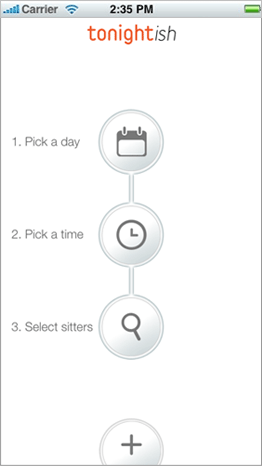
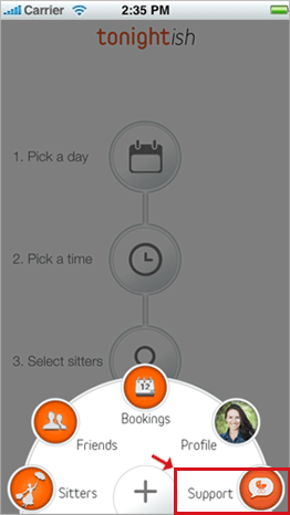
One of the things I love most about the features launched in iOS 7 is the new Transitioning APIs. I’m sure you have seen those cool animated transitions in apps like Evernote and the National Geographic app. You get to see cool rotations, zooms and animations on the navigation bar and you wondered, how the *!?* did they do that?

Take a look at the transitions in this video.

Prior to iOS 7, it was a pain to implement custom transitions so this is a welcome addition. In some of our new templates, we implement a couple of custom transitions that give your app that unique edge.

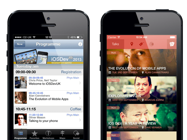
You can find this in our new iOS templates Highlights and Trackbeam.

With custom transitions, you can display modal views or navigation hierarchy views that are pushed on the stack. I decided to extract the transition code into a simple smaller project and show you how we did it.

How Did We Do This?

Here’s the walkthrough.

First off, your initial View Controller (the one who initiates the transition) need to implement the UIViewControllerTransitioningDelegate protocol.

Most importantly, these two methods will be implemented
animationControllerForPresentedController:presentingController:sourceController:
and animationControllerForDismissedController:

The first method asks your View Controller for the suitable object to control the animation during presentation. The second method asks for another object that controls the animation during dismissal.

- (id)animationControllerForPresentedController:(UIViewController *)presented
                                                                  presentingController:(UIViewController *)presenting
                                                                      sourceController:(UIViewController *)source
{
    self.animationController.isPresenting = YES;
 
    return self.animationController;
}
 
- (id )animationControllerForDismissedController:(UIViewController *)dismissed {
    self.animationController.isPresenting = NO;
 
    return self.animationController;
}

These can be same object as long as you specify behaviours for both presentation and dismissal.

The Real Mccoy: The Animation Controller

Now we need to implement this controller class, the culprit for controlling the animations. It conforms to the UIViewControllerAnimatedTransitioning protocol. There is also a similar protocol for interactive transitions but let’s make it simple for now.

In our case, we have a class called the DropAnimation controller and it implements a method called animationTransition.

This is the method below. It checks whether we are presenting or dismissing a controller, then executes the correct method.

-(void)animateTransition:(id)transitionContext{
 
    if(self.isPresenting){
        [self executePresentationAnimation:transitionContext];
    }
    else{
        [self executeDismissalAnimation:transitionContext];
    }
 
}

Now this is where the magic happens. The executePresentationAnimation method adds the new controller to the stage and then uses the new Spring animation methods on UIView to push in the view from the top as a modal view.

-(void)executePresentationAnimation:(id)transitionContext{
 
    UIView* inView = [transitionContext containerView];
 
    UIViewController* toViewController = [transitionContext viewControllerForKey:UITransitionContextToViewControllerKey];
 
    [inView addSubview:toViewController.view];
 
    CGPoint centerOffScreen = inView.center;
 
    centerOffScreen.y = (-1)*inView.frame.size.height;
    toViewController.view.center = centerOffScreen;
 
    [UIView animateWithDuration:self.presentationDuration delay:0.0f usingSpringWithDamping:0.4f initialSpringVelocity:6.0f options:UIViewAnimationOptionCurveEaseIn animations:^{
 
        toViewController.view.center = inView.center;
 
    } completion:^(BOOL finished) {
 
        [transitionContext completeTransition:YES];
    }];
}

And when dismissing, the reverse happens. We swing the view back up the stage and out of view.

-(void)executeDismissalAnimation:(id)transitionContext{
 
    UIView* inView = [transitionContext containerView];
 
    UIViewController* toViewController = [transitionContext viewControllerForKey:UITransitionContextToViewControllerKey];
 
    UIViewController* fromViewController = [transitionContext viewControllerForKey:UITransitionContextFromViewControllerKey];
 
    [inView insertSubview:toViewController.view belowSubview:fromViewController.view];
 
    CGPoint centerOffScreen = inView.center;
    centerOffScreen.y = (-1)*inView.frame.size.height;
 
    [UIView animateKeyframesWithDuration:self.dismissalDuration delay:0.0f options:UIViewKeyframeAnimationOptionCalculationModeLinear animations:^{
 
        [UIView addKeyframeWithRelativeStartTime:0 relativeDuration:0.5 animations:^{
 
            CGPoint center = fromViewController.view.center;
            center.y += 50;
            fromViewController.view.center = center;
        }];
 
        [UIView addKeyframeWithRelativeStartTime:0.5 relativeDuration:0.5 animations:^{
 
            fromViewController.view.center = centerOffScreen;
 
        }];
 
 
    } completion:^(BOOL finished) {
        [transitionContext completeTransition:YES];
    }];
}

Get the source code

I hope you are as excited to get new transitions into your app. Check out the Eventer template to get the full featured design with custom animations.

You can download the sample animation I just described above here

iOS 7 Re-design of a Conference App

I am currently attending the iOS Dev UK conference in Aberystwyth and I have already met loads of smart developers here working on cool stuff.

I have the conference app installed on my phone and I just couldn’t resist doing a re-design on it, (iOS 7 style of course). Co-incidentally, one of the upcoming iOS 7 templates is an Event template.

Check out the design below. I hope you like it.

ios-dev-uk-shots-2

ios-dev-uk-shots-1

ios-dev-uk-shots

The Process

The design is kind of simple if you take a closer look. I took pictures of the speakers and passed it through the Analog app. (I love the Realmac software’s apps BTW). I applied a couple of Instagram-style filters to the speaker images. These images serve as the background for each of the cells.

The text on each UITableViewCell is a simple label. Mix the right colors and you arrive at a nice looking app!.

Look out for Eventer launching in September after Tim lets iOS 7 loose!

P.S

We have updated more of our templates to work well with iOS 7. Here is a list of the ones that are live. We will post more to the site soon.
Foody, Socioville, Fitpulse, Flattened.

Rethinking Your Menu Buttons for iOS 7 - aka UIBarButtonItem

iOS 7 has landed with a bang and the user interface design speaks a new language. That language is called minimalism. Sometimes less is more. A common place where a lot of heavy design may lead to clutter is in your menu buttons. For the coders, this means your UIBarButtonItem-s.

While making updates to all your templates for iOS 7, we decided to strip some of the unnecessary adornments from our menu buttons. Give those babies some fresh air.

For example, here is how the famous “hamburger” button looked like on the previous version of the Socioville template.

socioville-menu-0

We decided to take out the borders and give it a clean look.

Consider doing the same for your icons. Your app will get easier to use. There will be more space for your UI elements and your users will thank you for a less cluttered design.

Here is the new look. (A subtle change but it does look a lot cleaner).

I have also decided to give you a “Hamburger” button as a freebie. In this download, you will get the large Photoshop version and the PNGs in both retina and standard resolutions.

socioville-menu-2

Click here to get it

.

All I ask is for you to share this post with your friends. Click on the Twitter/Google+ buttons on this page and let them know about it.

Thanks

How to Update Your App for iOS 7

As you probably know by now, iOS 7 has brought a couple of changes to the design language. This means your app needs to be updated so as not to look out of place on the OS.

Here at the Vault, we are going through the same process. You may have 2 or 3 apps to work on. But in our case, we have over 30 templates to update! That’s going to be fun.

NOTE: You can download our free Flat Design Pack here. This will give your apps a fresh look for iOS 7

So I thought since I am going to be going through the same headaches, I might as well blog about it and let you know of the pitfalls you might encounter.

ios-7-re-design-foody-1

Below, I will detail some of the changes we made to the Foody design template. The changes are now live and you can download the updated version if you have bought it previously.

Skeuomorphic Or Flat

I intentionally started this case study with the Foody template because it is arguably the most Skeuomorphic of the bunch. iOS 7 tries to tone down textures and shadows but that is a matter of taste. We decided not to retire the Foody template because a lot of you do like the template as it is still one of the bestsellers on the site.

We are going to tone down the effects a little bit but the leather is still going to stay. Else, Foody will lose its identity.

The Extended Navigation Bar

ios-7-re-design-foody-3

In iOS 7, the status bar and the navigation bar are now kind of intertwined. This means if you use custom images for your navigation bars, you will need to provide a separate “taller” image for the bar on iOS 7.

In my case, I exported a new navigation bar image from Photoshop which is 64 pixels high and then applied it when the user runs iOS 7.

First thing is to check whether the user in on iOS and below. This is done using a handy method

+(BOOL)isVersion6AndBelow{
 
    return floor(NSFoundationVersionNumber) <= NSFoundationVersionNumber_iOS_6_1;
}

And then I use the old navigation bar background image if the user is on iOS 6 and below. Else the app uses the new background image with the 64px height.

    UIImage *navBarImage = [UIImage imageNamed:@"navbar-7.png"];
    if([Utils isVersion6AndBelow]){
        navBarImage = [UIImage imageNamed:@"navbar.png"];
    }

Back Button and Bar Button Items have been Toned Down

ios-7-re-design-foody-2

Previously, the buttons on the Foody template had an inset embossed into the leather. This style is really prevalent on iOS 6.

For iOS 7 though, I decided to go with Apple’s guidelines and implemented borderless buttons. I think it looks better because the design is not competing with the content.

For the bar button items, I didn’t go all borderless though. I included a subtle transparent white background. This helps users understand this is a button and not just some text on the screen.

Here is how it was implemented.

This was the previous code that was used to customise the appearance of the navigation bar on iOS 6.

UIImage *barButton = [[UIImage imageNamed:@"navbar-icon.png"] resizableImageWithCapInsets:UIEdgeInsetsMake(0, 4, 0, 4)];
 
[[UIBarButtonItem appearance] setBackgroundImage:barButton forState:UIControlStateNormal
barMetrics:UIBarMetricsDefault];
 
UIImage *backButton = [[UIImage imageNamed:@"back-button.png"] resizableImageWithCapInsets:UIEdgeInsetsMake(0, 14, 0, 4)];
 
[[UIBarButtonItem appearance] setBackButtonBackgroundImage:backButton forState:UIControlStateNormal
barMetrics:UIBarMetricsDefault];

ios-7-re-design-foody-2

As you can see we use custom images for both the back button and the bar button items. I did away with all that and used the default setting. But I had to make sure the colour of the text is white. (Otherwise it shows up as blue).

[[UIBarButtonItem appearance] setTitleTextAttributes:[NSDictionary dictionaryWithObjectsAndKeys:
[UIColor whiteColor], UITextAttributeTextColor,
[UIFont boldSystemFontOfSize:16.0f], UITextAttributeFont, [UIColor darkGrayColor], UITextAttributeTextShadowColor, [NSValue valueWithCGSize:CGSizeMake(0.0, -1.0)], UITextAttributeTextShadowOffset,
nil] forState:UIControlStateNormal];

To apply the transparent white background on the bar button item, I use this helper method.

-(UIImage*)createSolidColorImageWithColor:(UIColor*)color andSize:(CGSize)size{
 
CGFloat scale = [[UIScreen mainScreen] scale];
UIGraphicsBeginImageContextWithOptions(size, NO, scale);
 
CGContextRef currentContext = UIGraphicsGetCurrentContext();
CGRect fillRect = CGRectMake(0,0,size.width,size.height);
CGContextSetFillColorWithColor(currentContext, color.CGColor);
CGContextFillRect(currentContext, fillRect);
 
UIImage *image = UIGraphicsGetImageFromCurrentImageContext();
UIGraphicsEndImageContext();
 
return image;
}

This creates a UIImage with the colour and size specified. I then use the method above to create a background image for my bar button item.

UIImage* barButtonImage = [self createSolidColorImageWithColor:[UIColor colorWithWhite:1.0 alpha:0.1] andSize:CGSizeMake(10, 10)];
 
[[UIBarButtonItem appearance] setBackgroundImage:barButtonImage forState:UIControlStateNormal barMetrics:UIBarMetricsDefault];

iOS 7 ready

There are other updates that I will write about in another post but for now. Foody is ready for the iOS 7 primetime.

If you have bought Foody previously, you get this update for free. Login here and download the update.

NOTE: You can download our free Flat Design Pack here. This will give your apps a fresh look for iOS 7

1 Tip For Giving Your App A New Look in iOS 7

One of the design changes in iOS 7 is the concept of layers. Instead of having your app look have distinct sections like the Navigation bar, Content View and Tab Bar, you can give it a new look by layering the view above or below each other.

You can see one of this changes in the way the Control Center slides up above views. Previously, that would have been implemented with a Modal View that was opaque but now since you can see the content below it, it gives it a whole new outlook.

There are many ways we can incorporate these in our own apps. One way we can do that is by having a transparent navigation bar image. (BTW, I just had a bright idea which I will include in our next template :-).

All the custom Navigation bars I have seen up until now are opaque. I was experimenting with a transparent Navigation bar while updating the Socioville template for iOS 7 and I came up with this.

Take a look at the Navigation bar in the video below.

The next step would be to blur the content showing up in the background. I will publish another post when I figure out how to do that.

I’m loving the idea of layers. That just gives a whole new meaning to how apps will look in the future.

You can already download the iOS 7 update for Socioville by logging into your account. OR if you don’t already have it, go here to get your own copy.

4 Tips to Designing a Good App Experience – Going Beyond the Visual

Pleasing color combinations, consistent themes, and well-crafted graphics can win a customer’s heart. However, the goal of designing for the customer experience is to win the customer’s subconscious. Creating an app that innately feels comfortable and enjoyable to the customer needs to go beyond the visual experience, and doing so will help drive customers to return and use the app again.

Designing a great app experience encourages customers to spend more time in the app and is something that requires a developer’s full attention. The needs of a customer can be different inside a banking app than a game or utility app. For every app there are a few tips that developers should employ to create a good app experience.

1. Optimize For The Mobile Device

You would think this would be obvious for anybody building a mobile app, but there are still so many apps that neglect this. The first mistake that I often see is putting too much on a page. The myFavorites app makes it really hard to use the features of the app with this design:

The myFavorites app has way too many options around organizing your favorites from your address book. Having too many buttons close together can lead to a lot mis-taps. This can often frustrate customers and result with the app being deleted. There are great ways to use minimal designs to showcase your app, but there are definitely minimalistic approaches that feel empty and plain. For example, the new popular car transport system Car2Go app:

This is the first page you seen when opening the Car2Go app. The login screen feels blank, almost like an afterthought. Half of the page is empty. Spending only thirty minutes to enlarge the input fields and the “login” button would drastically improve the customer experience, making it easier to read and better utilizing the space provided. A login page like this gives the feeling that the developers were not focused on making the best possible app and that type of feeling is something that shouldn’t be conveyed to the people using the app.

Little things can make a huge difference in crafting a good experience. For example, if you are asking for a phone number, or other number oriented data, the input field should open up the dial interface instead of the messaging interface. I notice every time a developer takes the time to do this.

Walk through every page of your app considering the layout combined with the ease of interaction. It is fine to have a page filled with buttons as long as they are all easy to click, and don’t clutter the screen. If it is a simple page, take advantage of the entire space. See how “the font game”, a game for testing your font identifying skills, designed their home page:

2. Sign Up Forms

Do not ask a customer to login or create an account immediately when they open the app for the first time. You get one chance to make an impression with your mobile app, and asking people to fill out a form before they experience what the app has to offer will drive people away. In one large scale app 75% of people did not complete the sign up form. After all the work to drive a download, you shouldn’t lose potential customers due to a sign up form. Instead, allow them experience the content of your app and how it works.

It is fine to want people to have an account or be logged in before having access to certain features of the app. However, let people navigate through the app and experience what they would be getting before introducing a forced registration form. Allowing everybody to experience your app before being pressed to login will result in a higher retention rate as people are already hooked by the content in your app.

3. Accessibility

Everything that your app has to offer should be accessible with two taps to the screen.. No one enjoys hitting the back button over and over again to navigate through an app, nor do we enjoy having to click through multiple pages to arrive at a specific page whose function has nothing to do with the previous pages.

A great simple way to improve the accessibility of an app is to have a button that can open up a toolbar for all the functions of the app. A great example of this is Urbanspoon’s mobile app:


Using this feature allows people to quickly move from between different places in the app, and doesn’t impede on the design of the main page. Being mobile is all about being fast. It is important to be able to move through and access all the functions of an app with only one or two taps from wherever you are.

4. Customer’s Voice –

As apps are always being updated and changed it is important for app developers to connect with the people using their app. The experience for a customer can be very deeply impacted by valuing the customer. The worst thing that can happen is when a customer doesn’t feel valued.

This can easily happen when there is no easy way for the customer to communicate with somebody from the app. Building a place where a customer can give feedback and be listened to inside the app is essential to creating a good customer experience. Having an outlet where customers can interact with the developers will build trust and loyalty between the customer and the app. A great design example can be found in the sitter app, Tonightish

A simple elegant design that highlights the core functions of the app: getting a sitter for a particular night. Under the “+” tab equal with all the other functions of the app is the ability to connect directly to the developers through the support button. This makes it clear that communication is valued by the developers of the app and encourages customers to use the support function as much as any other feature on the page.

From the first page and onwards, mobile apps need to be designed with the customer experience in mind. Designing for the customer is about making the app clear and simple to use while highlighting the functionalities of the app that make it useful. Following these four tips will improve the app experience. Your customers will appreciate your app due to the time you took to implement features that make them feel valued.

There are other ways to improve the customer experience and I would love to see other design tips or examples that improve the customer experience. Please don’t hesitate to post in the comments.

Want more tips?

Ezra Siegel is Apptentive’s VP of Community. Apptentive provides in-app feedback tools for app developers to improve ratings and user experience. He can be found writing on topics ranging from customer service to mobile apps, and most often where the two meet. You can read more along those lines at Apptentive’s blog, and keep up with Ezra and Apptentive on Facebook and Twitter.

iOS 7 - The Good, The Bad and The Ugly

Apple has finally released the much anticipated design of iOS 7. I am excited at the new API’s that will be available soon. But I am sure a lot of you are concerned about 1 thing and asking yourselves, “What changes do I need to do to my app?”.

ios7-screens

I’m sure we will find out in the months to come. But my initial reaction to the new design if iOS 7 was excitement. Excitement because we now have a whole new paradigm to start working with. It is literally the “new shiny object” that I can’t wait to start playing with.

I will have to admit that I don’t like some of the new additions. Like the Control Center design. The design looks really cluttered. And frankly, I hate the new UISlider, it looks too “Android”-y.

I am happy I don’t have to tap 7 times to dim the brightness of my screen when I want to read in bed without waking my wife up though.

design_functional_gallery1

Ushering in the new Era

If you are not excited about the design of iOS 7, see it this way. It is just a framework. Apple has set the precedent of prioritising “content over chrome”, now it is left to us to take that further and innovate with even better designs.

And, yours truly will be with you all the step of the way. Here are some changes you can expect at the Vault.

Loads of new fresh designs

We are going to be releasing loads of new designs in the fall as iOS 7 is released so stay tuned.

We have already started with the new Flattened template. Check it out here.

iphone

Templates will be retired

Some of our templates, the ones I feel don’t harmonise with iOS 7 will be retired. I can already see candidates in “Photoly” and “Foody” for retirement .

Redefining the landscape of App Design

This is a brave statement to make but I plan to get great minds together in the designer world and come up with even better designs than the iOS 7 default.

I am looking forward to the new era of app design. Stay tuned and let’s do this together.

10 iPhone Flat Design Screens You Can Download Now

Skeuomorphism is taking a hit lately. Personally, I kind of like the creativity that goes along with making a killer UI with gradients and shadows. But lately, I have been seeing some good examples of flat designs that look equally good.

Here at App Design Vault, we love to give you all the weapons in our arsenal so you can get that good looking app that stands out. That is why we launched the Flat Design UI pack for iPhone.

You can go here to download it. Here are some teaser screenshots.

flat-ui-feed-iphone-2-2

flat-ui-login-iphone-1-1

How to Load And Display A Twitter Stream In An iOS App

You probably have come across this situation before, you want to connect to Twitter and display the recent tweets of a given user in your app. Well, here’s how to get up and running.

At the end of this tutorial, you will be able to download a sample Xcode project that loads a Twitter feed into a UICollectionView. This is just one of the features of the Newsfeeder template. The complete template does loads more. You can load the most recent posts of any WordPress blog or valid RSS Feed, display a Facebook feed and more. Check it out here.

Let’s get started with the tutorial.

Authenticating a User’s Account

To be able to access the needed information from Twitter, we need to use a logged in account. To do so, we are going to access the saved account into the Settings app of the phone, and use the AccountStore class included in iOS 6. so here’s the code to get it:

self.accountStore = [[ACAccountStore alloc] init];
ACAccountType *twitterAccountType = [self.accountStore
                                         accountTypeWithAccountTypeIdentifier:
                                         ACAccountTypeIdentifierTwitter];
 
    dispatch_async(dispatch_get_global_queue(
                                             DISPATCH_QUEUE_PRIORITY_DEFAULT, 0), ^{
        [self.accountStore
         requestAccessToAccountsWithType:twitterAccountType
         options:nil completion:^(BOOL granted, NSError *error)
         {
             if (granted)
             {
                 NSArray *twitterAccounts = [self.accountStore
                                             accountsWithAccountType:twitterAccountType];
 
                 NSString *twitterAccountIdentifier = [[NSUserDefaults standardUserDefaults] objectForKey:AccountTwitterSelectedIdentifier];
 
                 self.account = [self.accountStore accountWithIdentifier:twitterAccountIdentifier];
 
                 if (self.account)
                 {
                     dispatch_async(dispatch_get_main_queue(), ^{
 
                         [[NSNotificationCenter defaultCenter] postNotificationName:AccountTwitterAccessGranted object:nil];
                     });
                 }
                 else
                 {
                     [[NSUserDefaults standardUserDefaults] removeObjectForKey:AccountTwitterSelectedIdentifier];
 
                     [[NSUserDefaults standardUserDefaults] synchronize];
 
 
                         self.account = [twitterAccounts lastObject];
 
                         dispatch_async(
                                        dispatch_get_main_queue(), ^{
 
                                            [[NSNotificationCenter defaultCenter] postNotificationName:AccountTwitterAccessGranted
                                             object:nil];
                                        });
 
                 }
             }
         }];
    });

This gives us access to the current account from the Settings app, that will be used for authentication in the following requests.

Getting the Twitter profile information

Now that we have the authentication covered, we are going to get the Profile information of the targeted account. Here’s how:

NSURL* url = [NSURL URLWithString:@"http://api.twitter.com/1.1/users/show.json"];
    NSDictionary* params = @"screen_name";
 
    SLRequest *request = [SLRequest requestForServiceType:SLServiceTypeTwitter
                                            requestMethod:SLRequestMethodGET
                                                      URL:url parameters:params];
 
    request.account = self.account;
 
    [request performRequestWithHandler:^(NSData *responseData,
                                         NSHTTPURLResponse *urlResponse, NSError *error) {
 
 
        if (error)
        {
            NSString* errorMessage = [NSString stringWithFormat:@"There was an error reading your Twitter feed. %@",
                                      [error localizedDescription]];
 
            [[AppDelegate instance] showError:errorMessage];
        }
        else
        {
            NSError *jsonError;
            NSDictionary *responseJSON = [NSJSONSerialization
                                     JSONObjectWithData:responseData
                                     options:NSJSONReadingMutableLeaves
                                     error:&jsonError];
 
	    dispatch_async(dispatch_get_main_queue(), ^{
                    self.profile = responseJSON;
                    [self setupProfile];
                });
 
 
        }
    }];

The code above connects to the Twitter API v1.1 using the url parameter. The response is a JSON object that is parsed using the NSJSONSerialization class in iOS.

Getting the Twitter feed

To accomplish this we will set a limit for how many items we want from the feed and pass the screen name we want to query. Using the returned array we’ll populate the collection view.

NSURL* url = [NSURL URLWithString:@"https://api.twitter.com/1.1/statuses/user_timeline.json"];
    NSDictionary* params = @{@"count" : @"50", @"screen_name" : @”twitterUsernameHere”};
 
    SLRequest *request = [SLRequest requestForServiceType:SLServiceTypeTwitter
                                            requestMethod:SLRequestMethodGET
                                                      URL:url parameters:params];
 
    request.account = self.account;
 
    [request performRequestWithHandler:^(NSData *responseData,
                                         NSHTTPURLResponse *urlResponse, NSError *error) {
 
        if (error)
        {
            NSString* errorMessage = [NSString stringWithFormat:@"There was an error reading your Twitter feed. %@",
                                      [error localizedDescription]];
 
            [[AppDelegate instance] showError:errorMessage];
        }
        else
        {
            NSError *jsonError;
            NSArray *responseJSON = [NSJSONSerialization
                                     JSONObjectWithData:responseData
                                     options:NSJSONReadingAllowFragments
                                     error:&jsonError];
           dispatch_async(dispatch_get_main_queue(), ^{
                    self.items = responseJSON;
                [self.collectionView reloadData];
                });
        }
    }];

The code above loads the Twitter stream of the user with the username “twitterUserNameHere”. The JSON response is again parsed and loaded into a UICollectionView that you see below.

Displaying the Twitter posts in a grid

Below you will see the final screen layout of the Twitter posts. We are using a bit of a special layout for the collection view. It resembles the Pinterest layout, something not defaultly accessible from the SDK. But using Nelson’s UICollectionViewWaterfallLayout we are able to display the feeds in a nicer way.

twitter-posts

Download the Final Sample Project

In a nutshell, that’s all folks. You probably will want to download the full sample here and browse the project to see how everything was implemented in full detail.

13 Things You Must Know When Starting Out in iOS/Mac Development

I wrote a post titled 30 Most Inspiring People to Follow on Twitter and it was very popular. This proved to me that there is a demand for good advice from people out there in the field developing/designing/writing about iOS apps.

I decided to get in touch and ask them this one question.

“Think back to when you started making iOS/Mac apps, if you were to give that “earlier you” who is starting out a piece of advice today, what would you tell him/her?”

See what they had to say to that below. There is a ton of good advice in these quotes so please heed them.

Make sure to share this on Twitter. Use the buttons to your left. And if you want to say thank you and have anything to add, please leave a comment at the end of the post.

  • Matt Gemmell

    Speaker, Founder - Instinctive Code

    There’s always room for better software. Every kind of app has been done a hundred times on iOS already, but there’s still a place for apps that are truly simpler, and better, and easier to use.

    Even in utterly saturated categories like checklists and text editors. If you think that your idea has some uniqueness, and some value, then you shouldn’t be afraid to build it and release it. If it’s something that you want, then there’s someone else out there who wants it too.

    Every app has been done a hundred times but there’s always room for better software <--Tweet this

    Follow @mattgemmell
  • Ray Wenderlich

    Founder RazeWare, Raywenderlich.com

    Don’t expect overnight success - keep learning and growing and making apps - each one will be better than the last!

    Don’t expect overnight success <— Tweet this

    Follow @rwenderlich
  • Mattt Thompson

    Creator of AFNetworking & NSHipster

    When I first started iOS, I had been a Ruby & Rails programmer for about 4 years. I definitely spent a lot of time grappling with the language syntax, and trying to get a handle on all of the system frameworks. Back then, tutorials for basic tasks were sparse, and there were almost no open source projects to speak of. I had to rely on Apple’s sample code and shear determination to get anything to work.

    But still, just the novelty of being able to create something for the iPhone was enough to make everything worth it. These days, I’m happy to say that an iOS developer starting out today has dozens of great resources and hundreds of open source libraries available at their disposal. For tutorials and sample code, I heartily recommend Ray Wenderlich’s site & NSScreencast. For anyone wanting to learn about more advanced topics, I write about obscure parts of Objective-C and Cocoa every week on NSHipster.

    As far as open source, CocoaPods is absolutely essential. Not only does CocoaPods make managing dependencies effortless, but it’s become an amazing tool for discovering new libraries. So much has changed since I first started out. It’s never been easier to get started and make amazing apps, so my advice to anyone starting out or considering iOS development is simple: go for it!

    It’s never been easier to make amazing apps, if you are considering it: go for it! <-Tweet this

    Follow @mattt
  • Dan Rowinski

    Mobile Editor, ReadWriteWeb

    Make sure to give design and development issues equal weight in the planning process. App developers often focus too much on what they “can” do without thinking of how it will look and how the user will interact with it when it is done.

    If you create killer functionality that is hard to use, people will not come back to your app. On the other side, if you create an awesome looking app that keeps crashing and does not do what it says it is supposed to do, users will flee. Look at Path or Instagram. Those are companies that balance design and functionality extremely well.

    Give design and development issues equal weight in the planning process <-Tweet This

    Follow @dan_rowinski
  • Jeremy Olson

    Founder, Tapity

    Don’t neglect the idea. We’ve all heard that the idea for an app doesn’t matter; it’s all about execution. I used to firmly believe that but then something happened. My second app, Languages, made more money in one day then my first app made in two years. What on earth? They both were well executed. Grades even won an Apple Design Award. They both were well marketed, being featured by Apple and the press. What was the difference?

    The idea.

    Grades was always limited by the small niche it served - college students who really care about their grades (a smaller niche than we would hope). Languages was much more universal. Almost anyone might be interested in a translation app that works without an internet connection. Don’t get me wrong, as this chart illustrates, niche apps can definitely make a lot of money but they have to be in niches that care so much about the app that they will pay a premium for it. Most apps, unfortunately, make the mistake of targeting a niche that would only pay 99 cents for their app, resulting in a disappointing business equation.

    Don’t target a niche that will only pay 99c for your app. <--Tweet this

    Follow @jerols
  • Marco Arment

    Instapaper, The Magazine

    Hire a designer <-Tweet this

    Follow @marcoarment
  • Peter Steinberger

    Speaker, Creator of PSPDFKit

    Don’t use Three20. Nah, seriously. Don’t lose faith, and take more risks. Back in 2009, I learned everything the hard way with writing a big social app that scraped web content. It got wildly successful and I was hooked on the platform. A few months later Apple shut it down, a few weeks before my first WWDC.

    I was really crushed and it took me quite some time until I got back to Xcode, and then some more to find the courage to quit my day-job to become a freelancer. Later on it was equally hard quitting freelance work and doing my own thing. It’s been a hell of a ride and it brought me where I am now, with a sustainable business - even though I could’ve been there faster.

    Don’t lose faith, take more risks! <-Tweet this

    Follow @steipete
  • Marc Edwards

    Lead Designer, Bjango

    Partnerships are vital. Find good people to work with, who complement your skill set. Respect them and learn enough about their craft to be able to talk the same language For iOS designers this means getting familiar with Xcode and the naming conventions Apple use for their UI elements. It means going to developer conferences and meet ups. We’re all part of the same team.

    Give back. The fastest way to learn is by openly sharing and discussing tips and techniques. Writing helps form solid opinions and serves as a great way to check you’re doing things the right way (if you’re not, you can be sure someone will let you know).

    Strategy is important. I love reading Asymco.com, ben-evans.com and listening to The Critical Path. It may not initially be apparent, but being well versed in where the industry is heading can give you insight into where design is heading, too. When things become more predictable, you can plan accordingly.

    Give back. The fastest way to learn is by openly sharing and discussing <- Tweet this

    Follow @marcedwards
  • Aaron Hillegass

    Chief Learning Officer, Big Nerd Ranch

    Being a developer involves a certain amount of smarts and confidence. In the case of beginning developers, these strengths can manifest as a flaw: Novice developers fall in love with their own ideas.

    Experienced developers, trained by years of being wrong, are much more skeptical of their hypotheses. So, if you are starting a career as a programmer, always be looking for easy ways to prove yourself wrong. I’ve even seen a bumper sticker on this topic. It read “Don’t believe everything you think.”

    Don’t fall in love with your ideas. Always look for ways to prove yourself wrong <-Tweet this

    Follow @aaronhillegass
  • Dave Verwer

    iOS Dev Weekly

    Don’t build an app thinking you will find an audience later, find the audience first and then build apps to meet their needs. <-Tweet this

    Follow @daveverwer
  • Daniel Jalkut

    Founder, Red Sweater Software, Co-Host of Core Intuition

    Always remember that the main thing separating people who succeed from people who donít is a commitment to keep trying while the others give up.

    Knowledge and cleverness are key components to achieving your goals but they pale in comparison to persistence and an unwillingness to admit defeat.

    What separates successful people from others is a commitment to keep trying <-Tweet this

    Follow @danielpunkass
  • Robin Raszka

    Co-Founder, Tapmates, Pttrns.com

    Don’t try to be the next Jony Ive. Focus on designing the best experience for real users.

    Never stop learning new things. Forget wireframes and especially uploading screenshots to Dribbble, instead, learn how to do your own working prototype and get it ASAP on the device and play with it.

    Focus on designing the best experience for real users <-Tweet this

    Follow @raszka
  • David Smith

    Founder, FeedWrangler, Host of Developing Perspective

    Make sure that you understand your own definition of what success looks like. It is a brutal marketplace if that is solely financial.

    For this to be an enjoyable living you need the enjoy the process and people involved. <-Tweet this

    Follow @_DavidSmith
  • Dan Counsell

    App Producer and Founder, Realmac Software

    Remember to keep things focused by removing all unnecessary elements and features. Sometimes having less features can be your biggest competitive advantage <- Tweet this.

    Follow @dancounsell
  • Craig Hockenberry

    Twitterific and Iconfactory

    When I first started developing software for the Mac, I got lucky. From day one, I worked with some very talented designers: Jeffrey Zeldman and the Iconfactory. Jeffrey and I have parted ways, but I still can’t imagine making a product without the help of my colleagues at the Iconfactory. It’s imperative to have a partner as you develop a product.

    And take this notion of partnerships a bit further: don’t be afraid to meet people. Work to overcome your introversion (we all have it!) and make time to develop relationships with your fellow designers and developers. There’s a lot to be learned from other people in our industry and you’re missing out if you’re just on the receiving end of the dialog. To help start that conversation, figure out what you know that others need to know.

    Don’t be afraid to meet new people. Work to overcome your introversion.<-Tweet this

    Follow @chockenberry
  • Rene Ritchie

    iMore, @MobileNations

    Consider the design as much as the code, and the marketing as much as the product. Development, design, and marketing are all distinct, equally important skill sets needed to ensure success. If you can’t code, hire the best coder you can. Same for design. Same for marketing.

    Anyone can get lucky, but the smarter you are, the luckier you’ll be.

    Development, design, and marketing are all distinct, equally important skill sets needed to ensure success <-Tweet this

    Follow @reneritchie

Picture Credits:
Rene Ritchie by iMore |
Ray Wenderlich By Cocoa Conf | Matt Gemmell by adelcambre| Marco Arment by webstock06 | Marc Edwards by Melbourne Cocoaheads | Aaron Hillegass by Duncan Davidson | Daniel Jalkut by Massivev