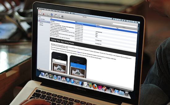
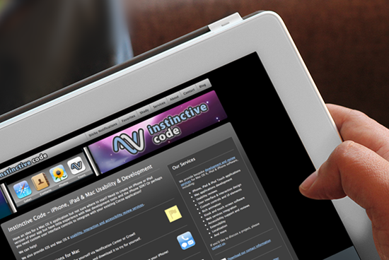
This year the celebration of well known Apple New Year in June in the company hosted World Wide Developer Conference or WWDC became very special with a somewhat ‘larger than usual’ announcement – the launch of Swift, a new multi paradigm compiled programming language for all Apple platforms like iOS and Mac OS X.
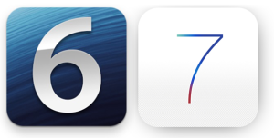
7 important tips for migrating to IOS 7
Over the weekend, iOS 7 was officially released to the public, after months of being in the hands of Apple’s entrusted community of developers, coinciding with the release of Apple’s latest iPhones, the iPhone 5S and 5C. Regardless of how revolutionary the hardware iteration is, no one can doubt that the operating system itself has gone one of the most radical changes, since it’s inception, something Apple dubs, “pure representation of simplicity”.
The flattening of the interface design, absent of skeumorphism and depth instead focus on a cleaner streamlined interface, powered by the animation dubbed the parallax. Sure there are indeed quite a few new API changes, as far as development goes, but designers will certainly feel overwhelmed with where to start. So to get things started, we will outline the 7 important tips for migrating to IOS 7.
1 SUPPORTING iOS 6 AND iOS 7
The first thing you need to worry about, as a developer and designer before moving to iOS 7, is whether you are carrying baggage with you. That is, will you need to still maintain support for iOS 6? Will you be designing this app from scratch for iOS 7? Are you migrating an existing project?
Apple still recommend that you design for iOS 7, adapting the visual principles and philosophy, which would still be valid in both iOS 6 and iOS 7. As for the translucent objects, such as navigation bars, or navigation buttons, re-introduce them back into iOS 6 using appropriate judgement. XCode provides a great tool to assist in the migration, by allowing you to preview through Storyboards, how your changes would look on both iOS 6 and iOS 7.
2 CLARITY
Clarity is the philosophy of ensuring your primary content or message for the screen is clear, free from distortion, interruption and visual decoys. This is more typographically-focused, and Apple recommend you follow the following clarity guidance:
- Negative spacing between elements to provide the sense of focus and noticeability, whilst ensuring you don’t overlap, you optimise boundaries between objects on your screen.
- Colour or rather a good pure system colour to annunciate important states subtly gives the app a similar theme.
- Font adjustability or rather Dynamic Typing should be employed to ensure that the app looks great at every font size, with the interface responding when the user selects a custom or system font and size.
3 DEFERENCE
Deference is the art of ensuring once’s art doesn’t get in the way of content, no matter how crisp and fluid the animation and highlights are in your app, and rather focus on the functionality of the app.
With the design guide of negative spacing and borderless buttons, you are encouraged to maximise your screen usage and dimensions, whilst avoiding inserts and thick borders and frames, as well as bezels, gradients, drop shadows and other visual indicators that compete with content for space.
Finally, using translucent UI elements, like those found in UINavigationBar allows you to slide content behind them, providing a transient hint whilst allowing your content extra height.
4 DEPTH
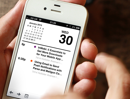
Depth affords a perceptive distinction through layers between on-screen objects, providing a sense of hierarchy and intuitiveness when interacting with the objects. Apple’s own calendar is a perfect example of hierarchy, providing a logical transition and depth from year-view, selecting a day displays a month-view, going all the way down to day-view. At all times you sense through animation the depth or level you are at, and how to get back.
5 LAYOUTS & CONTROLS
The use of Dynamic Fonts, means you need to anticipate variability in font typography and size, which means your UI element positioning and sizes need to adjusted adapt accordingly. So how do you do that?
Last year Apple introduced Auto-Layout in Interface Builder, a quite helpful visual and pro grammatical tool to anticipate changes in screen layout, and adjust each object relatively. This fluidity in positioning and sizing not only allows you to maintain a robust interface in iOS 7, but also makes life easier if you need to support both iOS 6 and iOS 7. So now you have a compelling reason to either adopt this tool, or go through the programmatic hassles of adjusting layout according to different text sizes.
Even thought it may seen that the borderless buttons Apple are emphasising look more condensed, button hit points still remains at 44×44, a long-standing standard Apple has advocated in their Human User Interface Guidelines. This is something you need to maintain when creating your own custom buttons.
Apple make use of Perspective, a visual weight and balance to create the perception of prominence of certain elements and buttons over others, as a more visually prominent button tends to be a more functionally prominent button.
6 ANIMATION
IOS 7 saw the birth of Parallax animation at a system level, a visual trickery in perception of size and depth, allowing certain objects nearer to appear larger, and Apple have simulated the effect when the phone is tilted or rotated around, thanks to gyroscope and accelerometers. For instance, you could see that the home icons appear subtly above the background. Going back to your app design, you should adhere to subtly, fluid gorgeous animation where you can, and where appropriate.
The general design principle for choosing animation is to communicate feedback and status/state of a task/app, whether they are touching an object, or awaiting a result from a touch or action, drawing attention to the outcome. The animation of pressing a button, switching a view needs to be subtly and not gratuitous, perverting the user from their intended primary task, or break the flow of the app. Apple have done a good job of providing animation in their standard UI controls, allowing iPhone users to anticipate consistency and familiarity, so it’s best you try and follow their philosophy and mimic similar animations for similar types of controls, and make them consistent throughout your app, as well as realistic, adhering to the laws of physics.
7 ICONS
Along with the borderless buttons, Apple’s new default styles for icons in bars are now constructed with a lighter stroke weight, which is perceptively more condensed even though the icon sizes remain the same. If you don’t use custom icons for your toolbar, then you will get the new icon designs for free.
System icons that you would find normally when you choose a standard icon for your bar button icon, look flattened, borderless and small. These are standard icons that will become more synonymous with iPhone users, and will be used by many apps to represent common app functions, such as bookmarks, camera, create/author and location, and so forth.
If you decide to design your own custom icons, you should aim to create an icon that is simplified, rather than something that is graphically complex. All of Apple’s system default icons are simple representation objects. You should also ensure your icons are recognisable and non-ambiguous, something that visually makes sense, following a consistent stroke weight and perspective, across your app.
If you are unable to visually represent a function graphically, you don’t have to create a graphical icon. Apple’s Calendar app makes use of text instead of icons, in it’s toolbar. This is especially effective if you only require one, two or three buttons in your tool bars.
Want to learn more?
- iOS 7 Transition Guide by Apple
- iOS 7 Human Interface Guide by Apple
30 Most Inspiring People to Follow On Twitter [For iOS Developers]
It is a good thing to learn from people that have “been there, done that”, people that understand the dynamics of the industry and share them freely.
That is why I compiled this list of people that inspire me. Be it with their apps, their podcasts, their blogs. The idea is that they share their experiences so that we that come after them don’t have to make the same mistakes.
This is why you should follow these people, learn from them and be a better developer. So, in no particular order, here goes.
UPDATE: Seems a lot of people on this list are getting new followers. To make it easier to follow them all, use this list
-

John Gruber
John is easily the most recognizable name in the industry. He posts this thoughts regularly on Apple news and events. The most recent one I found interesting was the commentary on flat design and the case against Skeuomorphism.
Also his podcasts should be a part of any developer’s week.
-

Craig Hockenberry
Craig Hockenberry is famous for his work at the IconFactory who developed Twitterrific. I listened to a podcast a while back and I discovered he designed a lot of the icons for application I have used and worked with for years. Even on the Windows platform.
He is frequently interviewed on podcasts and websites and loves sharing his experience.
-

Loren Brichter
Loren developed Tweetie which is now the official Twitter iOS app. He is responsible for the pull-to-refresh design pattern that is now a part of the iOS 6 Mail app.
Apple must have spent years trying not include it iOS but had to because it was just too good a control.
Check out his app, Letterpress
-

Daniel Jalkut
Daniel hosts the Core Intuition podcast along with Manton Reece. The podcast should definitely be in your weekly playlist if you want to keep up with what is going on in the world of iOS.
Daniel is predominantly a Mac developer and is the person behind MarsEdit
-

Manton Reece
Manton is a co-host with Daniel Jalkut on the Core Intuition podcast which as I said above should be part of your week. They comment on stories in the world of Apple and iOS. This is a good way to spot trends and understand what the wider community is talking about.
Manton has sworn never to go back to Twitter after they burned him and thousands of other developers. You will have to get on app.net to follow him.
-


Dave Verwer
Dave Verwer runs what is arguably the best researched newsletter in iOS, iOS Dev Weekly. It is a list of links on resources and tips that will benefit you as a developer. Definitely something to look forward to on a Friday afternoon.
-

Marco Arment
Marco is well known for Instapaper and recently, The Magazine. In my opinion, he has identified a sweet spot of app monetization: recurring subscriptions on the Newsstand platform. As a developer, you shouldn’t be satisfied with a 0.99c app which you will need to support forever. He explains the process he went through in the now defunct podcast, Build and Analyze.
He is also a fan of fast cars and coffee.
-

David Smith
David Smith is the host of Developing Perspective, another podcast that should be on your weekly playlist. David comments on struggles and wins that every indie developer goes through in the process of publishing apps.
It is important to know that others are going through the same experience.
-

David Barnard
David runs App Cubby with the flagship app, Launch Center Pro. The App Cubby blog should be in your reading list. It is a treasure trove of insights into developing, publishing, pricing and monetizing apps.
-

Ken Yarmosh
Ken is the creator of a suite of beautiful looking apps. Agenda, Buzz and Today. He shares a lot of interesting links on his Twitter feed so you will want to follow that. His book AppSavvy, is a good resource for learning how to turn your ideas into apps.
-
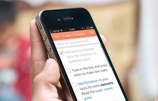

Sam Soffes
Sam Soffes is a prolific sharer and contributor to open source. Just check out his Github profile to see what I mean.
His app, Cheddar was open-sourced and it is a delight to go through the code and see how things are implemented. Very inspiring.
-

Marc Edwards
Marc Edwards is a prolific designer. Check out the amazing apps done at Bjango to see his work in action.
He co-hosts the Iterate podcast with Rene Ritchie, where they share their thoughts on design, development, skeuomorphism and all things in between.
-

Mike Rundle
Mike Rundle is one of the rare people who has got skills in coding and design. These people don’t exist of often. If you want to learn how you can have skills in both, check out Design Then Code
-
Rene Ritchie
Rene Ritchie must have written 2.5 million words on iMore.com and he is a prolific podcaster as well. I seem to always discover podcasts hosted by Rene.
The ones I listen to are Iterate and Debug. They should be in your podcast playlist if you want to be kept up to date about UI/UX design, iOS and Mac development.
-

Mark Jardine
Mark Jardine is Co-founder to TapBots who have blazed a trail when it comes to app design. Their apps TweetBot and more recently, NetBot are amazing pieces of art.
-

Sophiestication
Sophie Teutschler is the founder of Sophiestication. The entire range of apps are arguably the most beautiful to look at.
One of her apps, Articles won an Apple Design Award. The On This Day app is a perfect showcase of how skeuomorphism rocks.
-
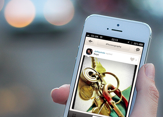

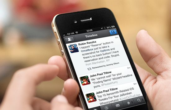
Robin Raszka
Robin is Product designer at Piictu. He also runs the popular site, pttrns.com where he showcases the best iOS designs on the App store.
The site is the place to go to when you need inspiration on your next app’s design.
-

Jeremy Olson
Jeremy is the Founder of Tapity, makers of the Grades app which won an Apple Design Award. What I like about Jeremy is the way he shares his experience with the community.
This is evident from his in-depth post on Smashing magazine, How to Succeed With Your Mobile App and the branch discussions on App Marketing.
-

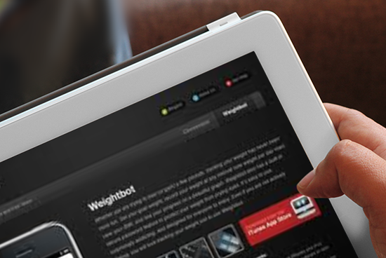
Paul Haddad
Paul Haddad is Co-Founder of TapBots who have blazed a trail when it comes to app design. Take a look at WeightBot and NetBot to see the attention to detail paid to the work at TapBots.
-

Ray Wenderlich
Ray Wenderlich runs, in my opinion, the best iOS tutorial site on the web. There are tons of free tutorials. The iOS By Tutorials series is also a must have if you want to keep up with the new APIs in iOS.
-

Keith Shepherd
Keith Shepherd is famous for the Temple run series. He is the Co-Founder of Imangi studios along with his wife Natalia.
Temple Run 2 was downloaded 50 million times in 2 weeks. A record by any standards. Instead of being tight lipped about their success, Keith and Natalia share their experiences by giving lots of interviews. That’s why they are inspiring.
-
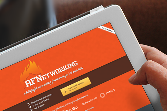

Mattt Thompson
Mattt is a prolific developer who has created one of the most used libraries in iOS/OS X. It is called AFNetworking with currently over 1000 forks on Github.
-
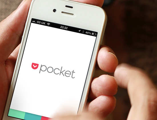

Steve Streza
Steve Streza is Lead Platform Developer at Pocket and he is a joy to follow on Twitter. Not only for his tweets about development but also off-topic info like Obama and Gangnam style.
His Gangnam style Mashup got over 100,000 views in the first weeks. I’m happy I got to see it before it got banned in the UK.
-
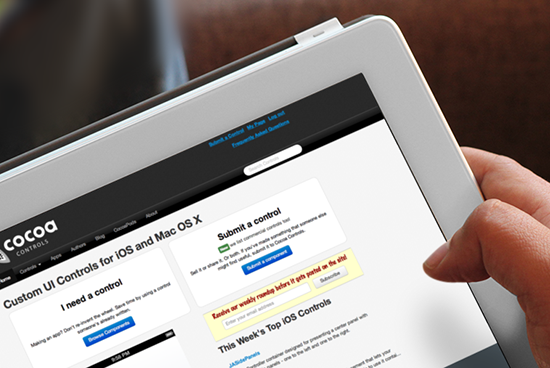

Aaron Brethorst
Aaron runs Cocoa Controls, the go-to site for custom iOS controls. The site currently has over 2000 controls both free and paid that you can drop into your app.
The curation is top class and there is no other site that comes close.
-

Matt Gemmell
Matt Gemmell blogs about iOS/OS X at his site and has published loads of open source components.
For more inspiration , Matt regularly speaks at conferences around the UK.
-

Matt Rix
Matt Rix is the developer behind Trainyard, a game which at some point rose to #2 in the App store beating Angry Birds.
He blogged about the experience here. It is always nice to see developers so open about their journey (struggles and successes so far).
-

Dan Counsell
Dan is the developer behind Clear, the to-do app that re-wrote the rules of UI app design. The Clear app was single-handedly responsible for lots of of gesture-based UI controls, and an open source control that mimics the paradigm is a top rated control on Cocoa controls.
I’m sure it must feel good to have affected an industry in such a way.
-

Evan Doll
Evan Doll is a Co-Founder at Flipboard. I use this app multiple times everyday and no other app can boast of that on my home screen.
He taught one of the first series of the CS193P iOS course at Stanford. I followed this course and was my first introduction to iOS 5 years ago.
-
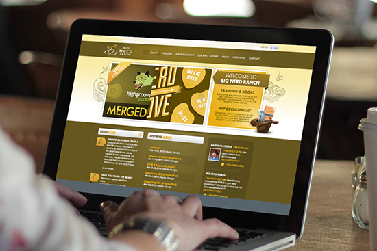

Aaron Hillegass
Aaron Hillegass is a Co-Founder at Big Nerd Ranch, a training company with amazing personality. The website alone lets you know that you are not dealing with your run-of-the-mill training house.
-
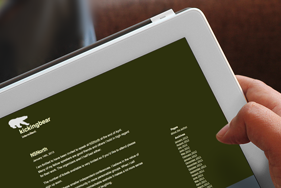

Guy English
Guy English is the man behind KickingBear where he has been blogging since 2009. The topics are generally ones iOS indie developers would like to follow.
He co-hosts the Debug podcast along with Rene Ritchie where they interview indie app developers. You will probably want to tune in to that as well
Is there someone you think should be on this list? Please leave a comment and let me know!
Screenshots were gathered using PlaceIt
The Ultimate Cheat Sheet For Getting Reviews On Top Blogs
Submitting your app to the App store is only the first step. If you want more than 2 downloads a day, you will have to get the word out.
App Review Sites are a good way to get more attention and downloads for your apps. The problem is, they get hundreds of pitches a day. How do you stand out? How do you get attention and get those reviews coming in?
That is what this infographic will help you with. How to write a pitch email that gets your app reviewed.

Embed this Infographic
Please copy the code below if you want to embed this on your site.
1 2 | <img src="http://www.appdesignvault.com/wp-content/uploads/2013/02/TopBlogs5.png"/> <br/>View full image <a href="http://www.appdesignvault.com/iphone-app-reviews/" title="App Design">App Design Vault</a> |
Downloadable Resources
- Download the Good Pitch sample here
- My interview with Erica Sadun, TUAW. on How to Pitch Your App
- Tokens App to send promo codes
Things To Include In Your Pitch
Here is a quick breakdown of the essentials that need to be in your pitch.
- Name of the app
- Link to iTunes (important, not only the app website but the iTunes product page)
- Video (a really important one)
- Screenshots (Don’t attach large files, include a link to them)
- Description (Say what your app does and why it is different)
- Price
- Contact information (add multiple options, email, twitter, skype, telephone)
Please share this page with your friends on Twitter and Facebook. Click on the share buttons on the left. Thanks!
3 Examples Of Minimal Design Done Well
Here are three apps that have the minimal design concept nailed down. I use these apps often and like how the controls kind of get out of the way and you get to interact with the app directly.
Google Maps

I loved the Google Maps app the moment I downloaded it. The app uses a minimal number of colours. Different shades of grey is used to make elements stand out or blend in to the background as needed.
The concept of navigation and tab bars are totally missing in the app. Making it look unique.

Flipboard is the best use case when talking about minimalism. The content is front and centre. The only distractions on the screen is the white navigation bar that takes you back to the main screen.
I like this app because the design is so dependent on the content but still manages to present itself gorgeously each time. This is hard to manage especially when you are dealing with feeds from bloggers who sometimes are design-challenged 🙂
Rise

It is hard to get a good screenshot that describes Rise because every screen shows the minimum amount of information possible.
But that is the beauty of it. You are only shown the most important information at any point in time. An alarm clock is simple, show me the time and how long I have to sleep. That is all.
Well done.
The First Really Minimal Vault Template

This month, I have been so inspired by the minimal design concept that I decided to release a design template that embodies minimalism on the Vault. Hopefully this will help you make your own stunning looking apps, apps that will rock your next update and get good reviews from your users.
Take a look at Metropolitan here
We decided to take a shopping app as a basic concept. The design is dependent on the content (products, bags, shoes) just like the Flipboard app but then we use a small number of colours (blue and shades of grey) to make things stand out.
This is live now and you can buy it at a discount now. Go here to find out more and get your copy of Metropolitan
Don’t hate on Skeuomorphism. Here Are 3 Reasons Why
Skeumorphism, has been a heated topic recently, dividing the mobile design community, with many critics already declaring this methodology utterly outdated, useless bloatware. The technique of taking high-status physical objects, like kettles and analogue knobs and applying them as UI elements, has been a design fixture of Apple, over the past few years, but with the untimely exit of iOS designer Scott Forstall this month, one of Apple’s fiercest skeumorphism evangelists, Apple may also have decided to have a change of philosophy.
Sure, we have seen plenty of examples of apps that have put skeumorphism in the wrong light, and when not done right, it is blatantly clear. Just take a look at Apple’s very own Podcast app, which was heavily bashed upon in the blogosphere, and whilst rightfully criticised, it is also a generalisation to outcast skeumorphism because of the implementation of a few examples.
So the guys at Apple don’t get everything right in design, and the designers tried to project a metaphor of an old-fashioned cassette-tape deck, which in it’s own right is a marvelous piece of animation and design, except it was designed at the expense of functionality. Buttons and targets were difficult to tap on, as well as having a lot of precious screen real-estate dedicated to non-functional aspects of the app.
Not to mention the biggest oversight, many of the younger generation wouldn’t have the faintest what a cassette-tape deck is, let alone floppy disks, so having an unrecognisable metaphor is a waste in a way. Having said that, we believe Skeumorphism is still a valid technique, and we will give you three reasons why.
1. Usability
Skeumorphism presents the benefit of recognition and familiarity, as is inferred in the meaning of the concept, when represented correctly, introduces a familiar object that the user has used in the real-world as a Ui control. Familiarity means encouraging more use, quicker adoption for new users by reducing the intimidation barriers.
Papers by FiftyFree, an innovative drawing and painting app, that like iBooks, has a home screen that is a physical metaphor of a table with notebooks. You choose a notebook, and the book opens up with pages, which allows the user to then flick between pages to navigate one’s portfolio.
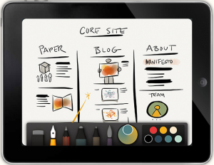
To open a page, the user would pinch out horizontally to stretch out the selected set of pages further. The drawing aspect is familiar to the users, in the same way other drawing tools are used, and using your finger is the most intuitive form of skeumorphism.
Essentially, the app does not seem to breach the level of excessiveness found in many poorly-designed apps, by not detracting from functionality, yet employs intuitiveness through familiar objects and actions (such as pinch and flick) to create a highly usable app.
2. Familiarity
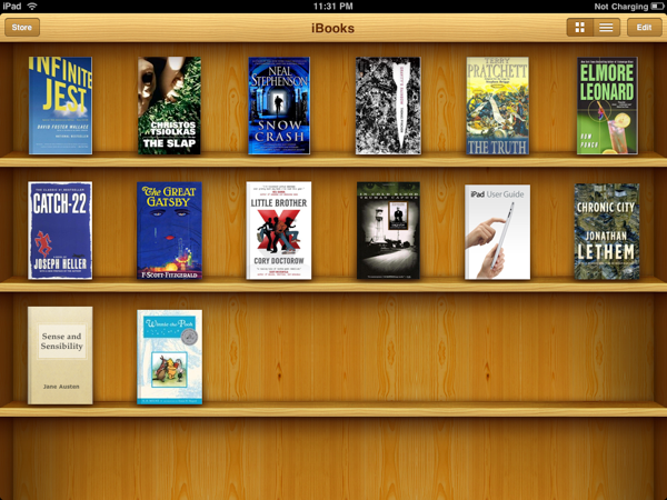
Going on from usability, you gain familiarity, and hold and behold, Apple’s iBooks is a prime example of that. For someone who hasn’t used this app before, the application’s home screen presents a bookshelf, with book covers to represent all the books in one’s collection, using a familiar and understandable metaphor of a pine-wood bookshelf to give the user an understanding of what is being shown and to be able to relate to it.
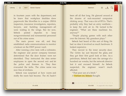
When reading a book, the user is presented with the sepia-paged book, and advancing pages is as intuitive as its real-life metaphor, swipe to flick a page, but also provides the option for users (in the latest iBooks version) to scroll downwards continuously to read, thus providing a more functional but less skeumorphic option.
The reader is also able to annotate the book, by highlighting through dragging one’s finger horizontally over text, to create a highlighting pen effect.
iBooks therefore proves a good skeumorphic design that aids usability, whilst not providing any skeumorphism that detracts from its’ intended functionality. More so, it provides users with the option to select different usability options.
3. Aesthetical/Nostalgic
OK, so not everything has a functional meaning. As long as it doesn’t hinder, one can appreciate apps that have chosen great and useful aesthetical/nostalgic UI features. Take the switch for example, it not only has a functional and familiarity benefit, but it’s also darn fun to flick left or right.
One can also appreciate the artistically vintage look of an app, and just like modernism, there is a market for vintage art. Granted, it is hard to nail from a designer’s perspective, and there are a lot of hits and misses, but when done right, you get a real appreciation.
The effect you get when you scroll down a tableView in an app, when you reach the end of the list, you get an elastic rebound, that signals a visual reference to the user that the application is at the end of the list.
So to put things straight…
The art is the result of an artist who uses the same canvas and brush as another artist, but how they envision something is the differentiating factor. There are many apps out there that are non-functional, and yes, anyone can skin an app to look like a leather binder, or animate something that interferes with their general usage. The mobile real-estate is very limited, and choosing something that complements the general flow is key.
Skeumorphism may be considered vintage, from a mobile operating system history, but it does not mean it is completely irrelevant. Just like art, or interior decoration, one may appreciate contemporary, modern or antique decorations. Take iBooks as an example of a skeumorphic app that makes using the application easier for many novice users, and provides nostalgic benefits for seasoned users of the application, whilst not detracting too much from functionality.
Looking at companies like Microsoft, which employ a rather contrastingly minimalist approach with Windows 8, across their devices and desktop Operating Systems. Whilst many in the community are stating that their modern approach is the way to go, they must also remember that a minimalist approach to design, whilst providing a clean and clear UX for users, can also be condescending for seasoned users.
That is, an interface that is too minimalist that it abstracts advanced features, such as working in terminal or tweaking advanced system settings can certainly also be annoying. And certainly when you look at competing devices like Android, there are certainly many other aspects that deserve greater attention, than dissecting the merits of skeumorphism, when you have usability, inconsistency and other aspects to bare in mind.
How To Customize Your App’s UITabbar
Sometimes, you just need a unique look and feel to the UITabbar to make your app stand out.
I made a video showing you how we did it for the Fitpulse template. You can see it below.
Let me know what you think.
If you like the video, please share it with your friends on Facebook and Twitter.
Transforming the World Drugs App : Extreme Makeover Part 1
This is the follow up post to the “Call for Apps” where I asked you to send me your app and I promised to choose one and basically do a free re-design.
What I wasn’t expecting was to see so many requests! So now I have to deliver right? (No pressure)
I am going to show you how I modified these apps so you can do the same to yours and turn it into a killer app.
The first app is World Drugs by Ary Tebeka
Here are some before and after shots of the process.
Watch this page, I am going to post all the updates in one long page filled with videos and screenshots and all.
Please leave a comment if you have any questions or just to leave your thoughts. Thanks!
Intro: Transforming the “World Drugs” app
World drugs tells you what name a drug is called in any country. You don’t want to be stuck in Zagreb with a headache and you don’t know what “Paracetamol” is called.
There are over 500,000 drugs listed in the app’s database. Ary has done a good job on this one.
It was featured in the App Store’s New and Noteworthy section, let’s see if we can get this to be featured again. (Top 10 Medical apps would be nice:-).
Here I am introducing the app and giving an overview of what I will be doing with this one.
Part 1 : Re-designing the Search Screen
The first screen up for a re-design is the search screen. For this, we are going to use the UI components available in the Socioville template.
Part 2 : Re-designing the Drugs List Screen
The second screen up for a re-design is the drugs list screen. This is going to be a quick one since we have a very similar list screen in the Socioville template.
Part 3 : Re-designing the Drugs Detail Screen
The third screen up for a re-design is the drugs detail screen. Even though we don’t have a detail screen in Socioville, nothing stops us from getting inspiration from another Vault template called Moments
Thanks for watching!. If you have any comments or questions, please let me know.
iOS 6 By Tutorials Review
iOS 6 is here and Apple has packed it full with a lot of juicy updates. If you want to learn how to implement the new iOS 6 features in your app, I would recommend nothing other than the iOS 6 by tutorials Book by Ray Wenderlich and the book team.
Watch the video below to get a sneak peek into the book and the resources you get.
Get the book here
As you probably know, I am part of the tutorial team at raywenderlich.com and I can safely say there are no tutorial sites with better quality tuts on the web.
This is for serious developers only. Only buy the book if you are an intermediate to experienced developer.
A newbie will not get any value from the book.
Please go here to get access to iOS 6 by tutorials.
If you buy the book through the links above, I will get a commission for the referral. If you prefer not to go through the link, no worries, you should get the book anyway, here is the direct link
http://www.raywenderlich.com/store
I’m new to this app thingy, where do I start?
I want to get an app on the app store but I am a newbie. Should I learn how to code? Or hire a developer?
I get this question every other day so here is an attempt to tackle this topic in depth. 100 words in an email is not able to do it enough justice, so here goes.
Should I learn how to code?
Programming is kind of becoming mainstream. What used to the domain of geeks and nerds is now starting to become cool. Are you for real? That’s some crazy stuff
Don’t believe me? Here is the the mayor of New York, Michael Bloomberg who has famously proclaimed that he wants to learn how to write code. And now some companies are also sending their entire teams (sales, marketing etc) to learn JavaScript.
Why is this the case? My take on it (and this whole post is simply that, just my own take, make your own conclusions) is that we are now entering an age where software products are seen as a way to make money.
There are enough tales about the Instagrams and billion dollar exits to entice enough of us to want to replicate the success even if it was just 1% of that billion, that would be enough:-)
There are no problems with wanting to have success but it cannot be your main motivation. Coding is hard and takes a lot of time and sweat and long nights in front of a computer trying to figure out why a button you put on the screen seems to disappear every time you start your app.
I am a developer and I love coding but last night I was developing an app that loads a file to Dropbox and I spent 4 hours on finding the path of the file alone. I was about to pull all my hair out ( then I realised I had none)
These glitches happen often and of you don’t love a challenge and solving problems analytically, don’t bother learning programming, you won’t make it past month 3.
If you are one of those people, you may be the luckiest person on earth because you may have just escaped the curse of a developer, which I will explain more about later in this post.
How do I Iearn how to code and write apps?
Okay, let’s say you like solving problems and you can’t wait to get your hands dirty and start making great apps, the question is now “Where do I start”?
You are in luck because it so happens that developers are the most generous people on earth. There is so much free stuff and sample code on the Internet that you probably don’t need to spend a dime to start writing your own apps.
Where else will you have a bunch of people who spend tens of hours figuring stuff out and posting it online for others to use for free?.
The first step is to learn the basics. All programming languages have some common concepts that you need to understand. Object orientation, code structure etc.
A good place to start is Codecademy which will help you with the basics. Once you have the basics, the next step is to start making some sample apps in the language of your choice. If you are on this site, chances are you want to make iPhone apps, so that means you need to learn objective C.
A great way to start is to go through the tutorials on Ray Wenderlich’s site. There you have full length epic tutorials that walk you through the development of an app from start to finish. If you want to start from the beginner level and get more basic tutorials, get the apprentice eBook. You will get more tutorials that hold your hand through the process.
After that, you are ready to start rolling out those apps. Get your hands dirty by browsing sample code on GitHub and discover how the world best developers do stuff.
Those are the things you need to do if you want to learn how to code, what if you don’t or can’t be bothered?
Should I hire someone to build my app?
Earlier in this post, I hinted at what I call “the curse of a developer” and you may be better off not knowing how to code. Read this post to find out more about to curse.
The main gist of it is, coding is not the most important skill to have as a startup. Being able to market and get attention for it is 80% of the work that needs to be done. Your time is better spent where it matters the most.
I spent years making software products hoping that someday someone would take notice and I would hit it big. When that didn’t happen, I tried to hire a marketing manager that was going to market my stuff like a pro and get me thousands of customers. That also did not happen.
I decided to learn marketing and stuck in it and now I know how to get the word out about my own stuff. Now, I freaking love marketing and I don’t know why I didn’t learn it earlier.
So I believe the best way is to have someone else do the work of developing the app while you focus on getting the word out there.
Spending 4 hours animating a button will make you $0 but spending 4 hours emailing potential partners can make you $10,000. Choose one <- Tweet this.
That being said, you still need to know enough developer speak to communicate well with who you want to hire. So I still recommend learning the basics and knowing what it takes to make an app.
How do I hire someone to make my app ?
The global economy means we now have access to the whole world as a resource to tap into when we are looking to hire talent.
Sites like Odesk.com and Elance.com have a marketplace where you can post a job for free and have tens of talented app developers bid to work on your app.
This means you need to have some funds to invest upfront. The two sites I mentioned will allow you to hire someone from $600 - $10,000 depending on how complex your app is.
I will advise you start with a small idea to get your feet wet. Don’t go gun ho with your complicated app idea and want to hit it out of the park. Outsourcing is like an art and you need to master it so you don’t get taken for a ride.
There are lots of talented developers out there but there are also lots of crappy ones. Please take a look at the previous jobs they have done and the feedback they got from previous employers. Don’t always go for the cheapest, because you get what you pay for.
So that concludes this long ass post on what to do if you have the question…. Should I learn how to code or hire someone to build my app?
If you have any questions, please leave it in the comments or if you disagree with anything I have said, let me know too… It is a free world (I think)….