Designers seem to have this superpower that we developers can’t get a grasp on. They know how to make an app UI look good and sometimes we think we can replicate the look and feel.
30 hours later, we still on the first screen with so many lines of code written but nowhere near the look and feel we desire. That can be frustrating.
The good news is that the designer superpower is not so super after-all. There are some simple hacks in design and if you understand them, you can also make your UI look good with minimal effort.
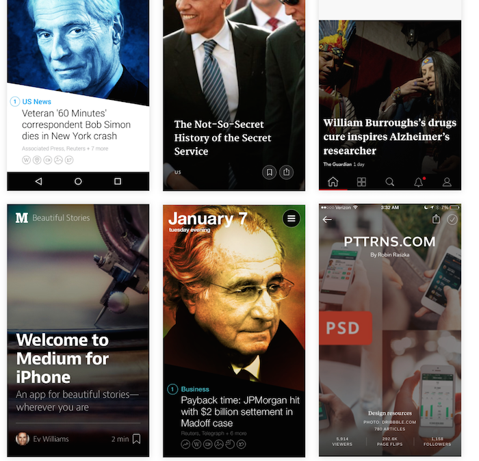
Today, I am going to show you one of these hacks. I am going to call it the Annotated Image Hack - that’s kind of a fancy name for putting text on an image. We put these to great use in our Mega template, click here to see it. This is just one of the tricks of the trade on how to make good looking UI.
This design concept can be used in Table View Cells, Collection Views etc.
But you can’t just slap on text on any image and pray it looks good. Below you will find 6 different techniques on how to do it beautifully.
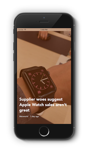
1: Simply Add Text
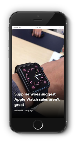
Yes, I know I said you can’t just add text on any image and it will looks good. Sometimes you might be lucky, just like in this image below. This is okay because of the way the text elements are aligned with the title larger than the others etc.
Also, it so happens that the text is on a darker part of the image. What if this wasn’t the case. See this example here below. Now since this is a different article with a new cover image, the text is hard to read.
So what do we do?
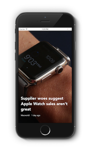
2. Add an overlay
You can simply add an overlay above the image. The trick is to make the overlay dark and transparent or tinted like in the Yahoo News Digest app.
In this case, it works because the color of the font is white.
The screenshot of the sample project we are working on is below.. And after that you will see the code achieve this effect.

func addFullOverlay(){ let overlayView = UIView(frame: CGRectZero) overlayView.translatesAutoresizingMaskIntoConstraints = false overlayView.backgroundColor = UIColor(red: 0, green: 0, blue: 0, alpha: 0.5) self.view.insertSubview(overlayView, aboveSubview: coverImageView) let topConstraint = NSLayoutConstraint(item: overlayView, attribute: .Top, relatedBy: .Equal, toItem: self.view, attribute: .Top, multiplier: 1, constant: 0) let leftConstraint = NSLayoutConstraint(item: overlayView, attribute: .Left, relatedBy: .Equal, toItem: self.view, attribute: .Left, multiplier: 1, constant: 0) let rightConstraint = NSLayoutConstraint(item: overlayView, attribute: .Right, relatedBy: .Equal, toItem: self.view, attribute: .Right, multiplier: 1, constant: 0) let bottomConstraint = NSLayoutConstraint(item: overlayView, attribute: .Bottom, relatedBy: .Equal, toItem: self.view, attribute: .Bottom, multiplier: 1, constant: 0) view.addConstraints([topConstraint, leftConstraint, rightConstraint, bottomConstraint]) } |
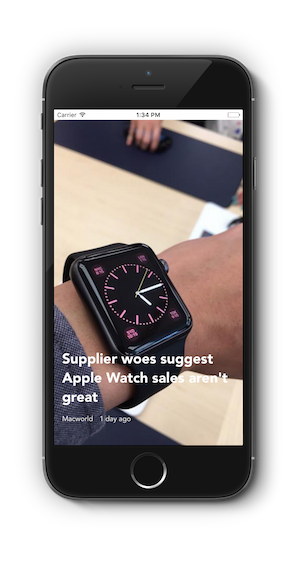
But this effect is not optimal because the colors on the image is now dull and can looks washed out. This might actually be what you are looking for. By adding a tint to the overlay, you can have an instagram style filter to the image. Just like in the image here.
All that needs to change is the color of the transparent overlay.
overlayView.backgroundColor = UIColor(red: 0.5, green: 0.2, blue: 0, alpha: 0.5) |
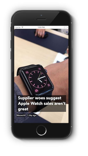
3. Text on a Background
Not every one wants their images to look different in the app. So the full overlay might not be the one for you. If you still want to keep the original color of the image, you can use this technique. See it used in the Funny or Die News app.

Or just like in our case, you can add a background for only the text itself. You can easily add a background for the text by using the NSAttributed text properties.
Here is the code to achieve this effect.
func addBackgroundColorToText() { let style = NSMutableParagraphStyle.defaultParagraphStyle().mutableCopy() as! NSMutableParagraphStyle style.firstLineHeadIndent = 10.0 style.headIndent = 10 style.tailIndent = 0 let attributes = [NSParagraphStyleAttributeName : style] let attributedTitleText = NSAttributedString(string: "Supplier woes suggest Apple Watch sales aren't great", attributes: attributes) titleLabel.attributedText = attributedTitleText let textbackgroundColor = UIColor(red: 0, green: 0, blue: 0, alpha: 0.6) titleLabel.backgroundColor = textbackgroundColor authorLabel.backgroundColor = textbackgroundColor dateLabel.backgroundColor = textbackgroundColor } |
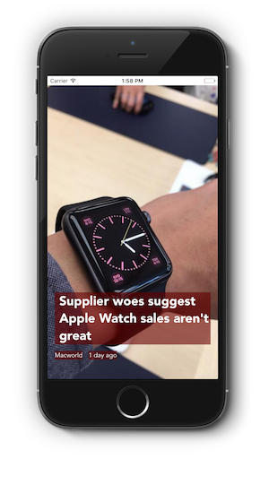
4. Text on a Tinted Background
Or if you don’t fancy black, you can change the color of the background and you have a tinted background. Homework for you:-) Find the dominant color in the image and use this as the tint color.
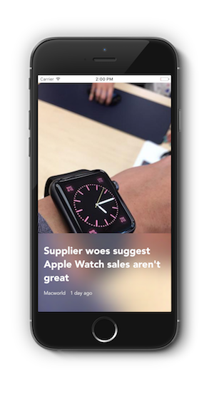
5. Blur the image
This is my favorite effect. And iOS 8/9 makes it easier to implement using the UIVisualEffectView class. We use this effect in our Newsstand template. Since the part of the image behind the text is blurred, it is easier to read.
Here is the code to achieve this effect.
    func addBlurView(){

        let effect = UIBlurEffect(style: .Light)

        let overlayView = UIVisualEffectView(effect: effect)

        overlayView.translatesAutoresizingMaskIntoConstraints = false

        self.view.insertSubview(overlayView, aboveSubview: coverImageView)

        let topConstraint = NSLayoutConstraint(item: overlayView, attribute: .Top, relatedBy: .Equal, toItem: self.titleLabel, attribute: .Top, multiplier: 1, constant: -30)

        let leftConstraint = NSLayoutConstraint(item: overlayView, attribute: .Left, relatedBy: .Equal, toItem: self.view, attribute: .Left, multiplier: 1, constant: 0)

        let rightConstraint = NSLayoutConstraint(item: overlayView, attribute: .Right, relatedBy: .Equal, toItem: self.view, attribute: .Right, multiplier: 1, constant: 0)

        let bottomConstraint = NSLayoutConstraint(item: overlayView, attribute: .Bottom, relatedBy: .Equal, toItem: self.view, attribute: .Bottom, multiplier: 1, constant: 0)

        view.addConstraints([topConstraint, leftConstraint, rightConstraint, bottomConstraint])
} |
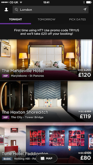
6. Gradient Fade
This is my second favorite effect, or sometimes it beats the Blur effect to number one depending on my mood :-).
This is achieved by adding a gradient layer behind the text. The gradient color goes from transparent black to opaque black. Kind of a neat trick, huh.
This is used in the Flipboard app or online on the hero image on any Medium blog. You can see it here used in the Hotel Tonight app too.
To achieve this effect, you can use the code below.
func addGradientOverlay(){ self.view.insertSubview(gradientView, aboveSubview: coverImageView) gradientLayer.frame = gradientView.bounds let opaqueBlackColor = UIColor(red: 0, green: 0, blue: 0, alpha: 1.0).CGColor let transparentBlackColor = UIColor(red: 0, green: 0, blue: 0, alpha: 0.0).CGColor gradientLayer.colors = [transparentBlackColor, opaqueBlackColor] gradientView.layer.insertSublayer(gradientLayer, atIndex: 0) gradientView.translatesAutoresizingMaskIntoConstraints = false self.view.insertSubview(gradientView, aboveSubview: coverImageView) let topConstraint = NSLayoutConstraint(item: gradientView, attribute: .Top, relatedBy: .Equal, toItem: self.titleLabel, attribute: .Top, multiplier: 1, constant: -60) let leftConstraint = NSLayoutConstraint(item: gradientView, attribute: .Left, relatedBy: .Equal, toItem: self.view, attribute: .Left, multiplier: 1, constant: 0) let rightConstraint = NSLayoutConstraint(item: gradientView, attribute: .Right, relatedBy: .Equal, toItem: self.view, attribute: .Right, multiplier: 1, constant: 0) let bottomConstraint = NSLayoutConstraint(item: gradientView, attribute: .Bottom, relatedBy: .Equal, toItem: self.view, attribute: .Bottom, multiplier: 1, constant: 0) view.addConstraints([topConstraint, leftConstraint, rightConstraint, bottomConstraint]) } |
Download the sample project
Like these effects? Now you know how to implement them, you can use them in your app. Click here to download the sample project where all the effects are implemented.
For more information on the research done for this post, take a look at this post on Medium.
Let me know your thoughts and if you are able to use this in your app, please let me know.
These are simple tips that can make a world of difference! Thanks.
Thanks, Lawrence.. Glad you like it..
Hi,
Excellent tutorial. I download the aforementioned app. I am relatively new to Xcode development. When I tried running it, got this error:
“Xcode cannot run using the selected device.” I can’t seem to change the “iOS Device”
How do I change the simulator?
There should be a button at the top-left of Xcode with a drop down that lets you change to the simulator
Indeed Lawrence. I know what to play around with on my next app.
Super!, thank you!
Thanks so much Tope for making these examples available - elegant in both app and code. And some more Swift to study … 🙂
Great tips Tope. Thanks heaps. The sample code is concise and very worthy.
Hi Tope, Which version of Xcode should the sample project be able to run under ? I’ve tried Xcode 6.4 but it is showing SWIFT compilation syntax and storyboard errors and the deployment target is set to iOS9. Is it possible under iOS 8 as well ?
Hi Phil,
Please use Xcode 7, you can download it from here
https://developer.apple.com/xcode/downloads/
Thanks Tope. Will give it a go once it comes out of beta.
Hey!, nice tips, but now i wanna know how to apply the Gradient Fade to an image view into a custom cell.
Thank you!!
Fears push people to iasernce their credentials. Will employers care about how many diplomas and degrees the applicants have or when and where and work experience they have ?
When it comes to design user interface you should be focusing on graphic design as well as other services of that website which I learned from https://www.logocrust.com/
This is really a great post. Thank you for taking time to provide us some of the useful and exclusive information with us. Keep on blogging!!
Pingback: 6个iOS图片文本设计小技巧 - 恰同学少年-不称